Creating a calming and restorative bedroom is no longer a luxury—it’s a necessity in our increasingly overstimulated world. As 2026 ushers in fresh interior design trends, color has emerged as a powerful tool to influence our mood, improve our sleep quality, and create spaces that nurture our mental well-being.
This guide explores the top 2026 bedroom color schemes for relaxation, grounded in color psychology, wellness-focused trends, and expert insights. Whether you’re redesigning your entire space or just refreshing your walls, you’ll find inspiration to transform your bedroom into a serene retreat.
Why Bedroom Color Matters for Relaxation
Your bedroom is more than just a place to sleep—it’s your sanctuary. The colors that surround you in this space have a profound effect on your nervous system, emotional balance, and overall mental health.
According to the American Psychological Association, visual stimuli, especially color, significantly affect heart rate, anxiety levels, and melatonin production. In fact, studies show that calm-toned bedrooms can improve sleep duration by up to 30% compared to those with bright, stimulating hues.
Here’s Why Bedroom Color is Crucial:
- Impacts Circadian Rhythms: Soft, cool tones help regulate the body’s internal clock.
- Reduces Stress Hormones: Muted hues like sage green and dusty blue are known to lower cortisol levels.
- Promotes Better Sleep Quality: Warm neutrals and nature-inspired palettes can help you fall asleep faster and stay asleep longer.
📌 Design Tip: Choose colors based on how you want to feel, not just how they look.
Color Psychology: How Colors Influence Mood and Relaxation
Before diving into 2026’s trending palettes, it’s essential to understand how color psychology plays a role in bedroom design.
Color Effects on the Brain:
| Color | Psychological Impact | Best Use in Bedrooms |
| Soft Blue | Reduces anxiety, calms the mind | Walls, bedding, curtains |
| Sage Green | Connects to nature, refreshes energy | Accent walls, plants, linens |
| Beige & Taupe | Warm, secure, grounding | Walls, furniture, flooring |
| Lavender | Relieves tension, promotes calmness | Throws, pillows, light features |
| Warm Clay | Comforting, stabilizing | Walls, textiles, decorative elements |
“Colors are the smiles of nature.” — Leigh Hunt, English Poet
Each color stimulates a different part of the brain. For example, cool hues like blue and green activate the parasympathetic nervous system, which promotes relaxation and slows heart rate. Conversely, vibrant reds and oranges tend to stimulate the senses, increasing alertness—making them less ideal for bedrooms.
Principles of Color Psychology in Bedroom Design:
- Stick to desaturated tones over saturated ones for relaxation.
- Incorporate a balanced palette with one dominant calming color.
- Use texture and lighting to enhance the psychological effect of the colors.
Trending Color Characteristics in 2026
The color trends of 2026 are deeply intertwined with themes of mental wellness, sustainability, and biophilic design. This year, we’re seeing a noticeable shift away from sterile whites or high-contrast modern palettes in favor of soft, earthy, and organic tones.
Key Characteristics of 2026 Color Trends:
- Muted & Dusty Shades: Think stormy blue, eucalyptus green, and pale mauve.
- Warm Undertones: Beige, sand, and clay tones with cozy, grounding effects.
- Nature-Inspired Colors: Drawing from forests, oceans, and the sky.
- Multi-Sensory Appeal: Colors that also work with natural materials like linen, wood, and wool.
✨ Featured Palette for 2026 Bedrooms:
| Color Name | Description | Mood Created |
| Serene Sage | Soft herbal green | Restorative |
| Misty Taupe | Beige with a grey undertone | Calm & Warm |
| Dusty Rose | Pale pink-mauve blend | Comforting |
| Ocean Dusk | Faded blue with grey notes | Peaceful |
| Desert Clay | Muted orange-brown | Grounded |
These shades not only support a relaxing atmosphere but are also versatile—easily paired with natural woods, soft textiles, and ambient lighting.
Top Relaxing Color Families for Bedrooms in 2026
With wellness at the heart of design, 2026 introduces a wave of color families that promote calmness, serenity, and emotional balance. The focus is on harmony with nature, soft edges, and earthy tones. Let’s explore the standout categories that define restful bedroom palettes this year.
Soft Neutrals: Calm in Simplicity
Neutral doesn’t mean boring. In 2026, soft neutrals like ivory, oat milk, greige, and pale almond are leading choices for minimal, tranquil spaces.
Why They Work:
- Reflect natural light gently, without harsh glare.
- Create a clean canvas that soothes the senses.
- Easy to layer with textures like linen, wool, and rattan.
Styling Tips:
- Pair greige walls with soft white bedding and light wood furniture.
- Add warmth with woven textures and matte finishes.
📌 Pro Tip: Use matte or eggshell finishes to avoid reflective surfaces that can feel cold or sterile.
Muted Greens: Nature-Inspired Calm
As biophilic design dominates 2026 interiors, muted greens are more than a trend—they’re a wellness strategy. Think sage, moss, and eucalyptus.
Psychological Benefits:
- Green promotes mental restoration and equilibrium.
- Linked to reduced blood pressure and anxiety levels.
- Mimics outdoor environments, grounding the mind.
Best Combinations:
- Sage walls with cream or sand-colored bedding.
- Olive or eucalyptus accents via curtains or throws.
🪴 Case Study:
A wellness retreat in Asheville, NC used sage green walls with terracotta accents and reported increased guest satisfaction on sleep quality surveys by 22%.
Dusty Blues: A Cool Path to Tranquility
Blue has always been a favorite for bedrooms—but dusty and desaturated shades are what make 2026 unique.
Top Picks:
- Stormy Blue
- Powder Denim
- Misty Sky
Why It’s Effective:
- Blue lowers heart rate and body temperature.
- It’s associated with trust, calm, and reflection.
Interior Pairings:
- Combine with warm wood tones to prevent a cold look.
- Add plush textures like velvet or flannel to maintain comfort.
📌 Design Rule: Avoid overly bright or stark navy tones—they can feel too crisp or formal.
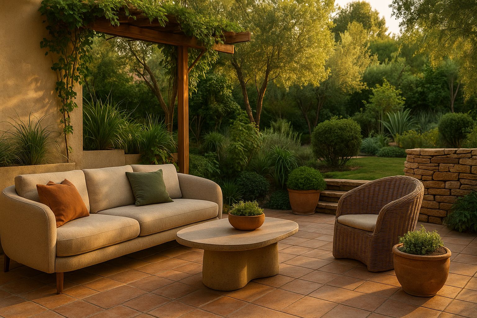
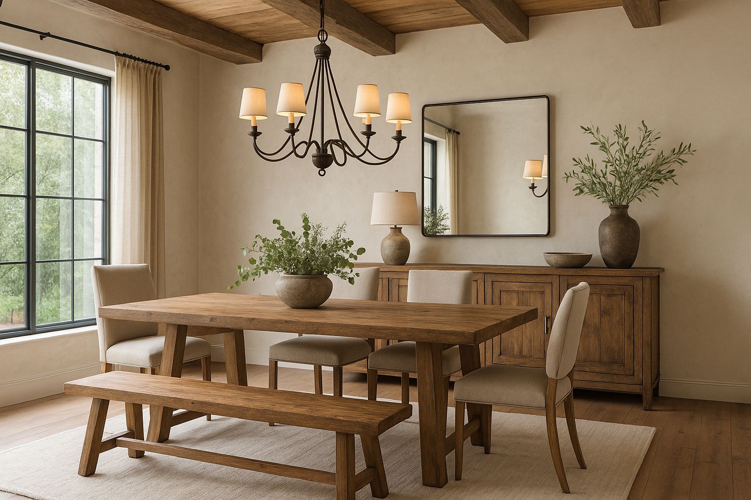
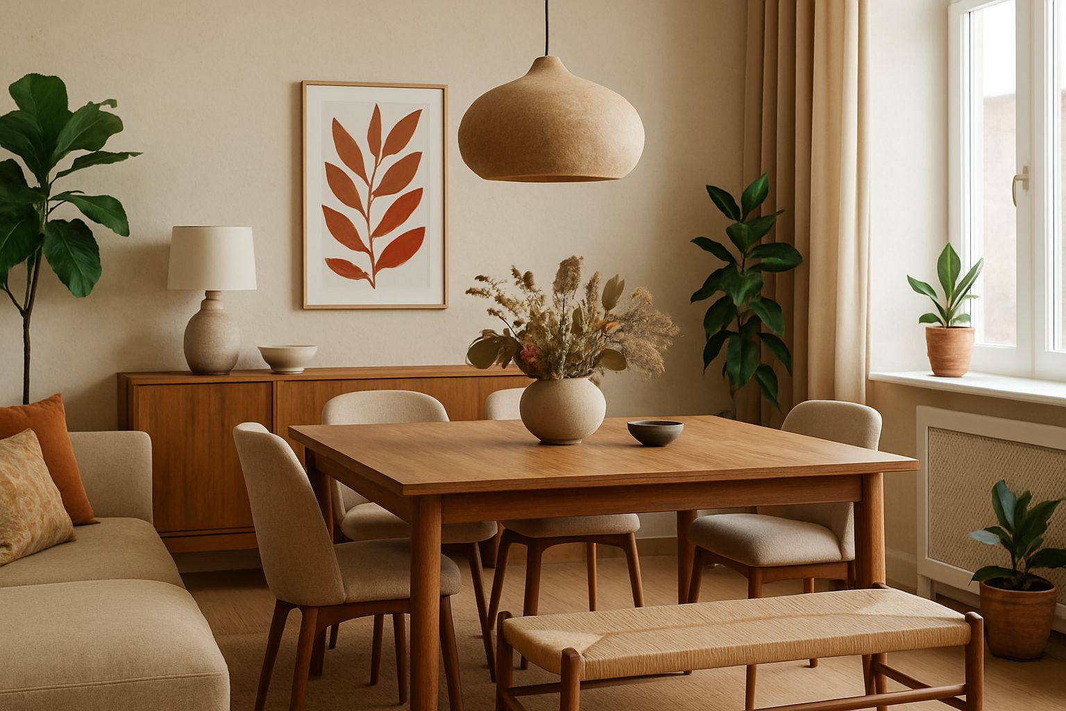
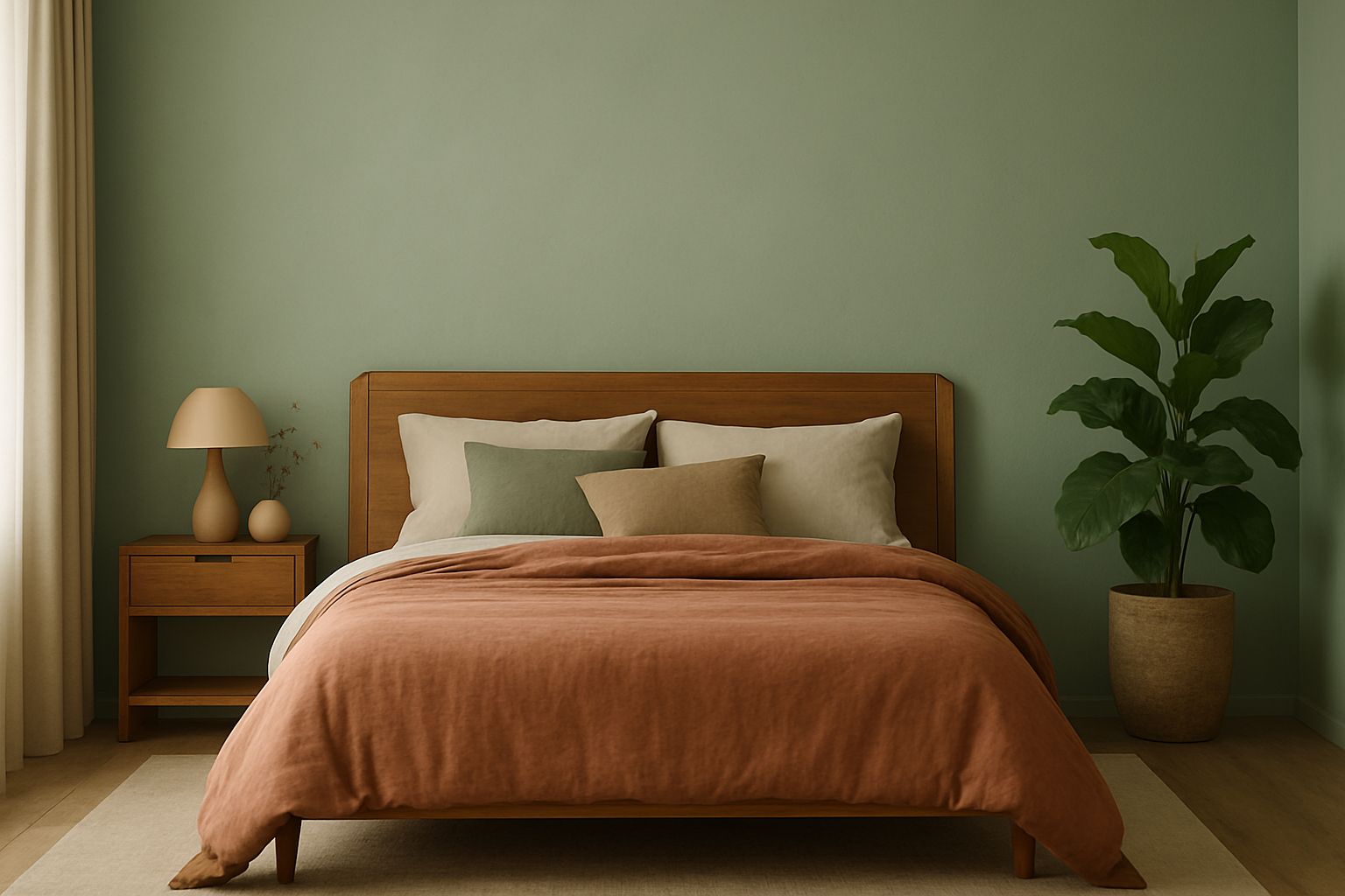
Warm Earth Tones: Grounding and Comforting
This palette brings emotional warmth and a sense of rootedness, ideal for a cozy and intimate space.
Trending Colors:
- Terracotta
- Clay
- Soft Cocoa
- Burnt Sienna
These tones promote comfort and connection, encouraging rest and relaxation.
Room Ideas:
- Terracotta accent wall behind a soft beige headboard.
- Burnt orange pillows layered with off-white throws.
“Warm colors create a womb-like effect that cocoons the senses.” — Emma Bower, Interior Wellness Consultant
Lavender and Mauve: Soft Florals for Serenity
These soft purples are becoming wellness favorites in 2026 for their delicate and romantic charm.
Effects on Mood:
- Lavender is associated with reduced insomnia and anxiety.
- Mauve adds a touch of femininity without overwhelming the senses.
How to Style:
- Use lavender for bedding or curtains and balance it with stone grey or muted taupe.
- Accent with brushed gold, soft ceramics, or frosted glass.
📌 Mood Booster: A spritz of lavender essential oil on pillows enhances the relaxing power of this palette.
Two-Tone Combinations for Depth and Balance
Layering is key in 2026. Two-tone schemes add visual interest without overwhelming the space.
Best Two-Tone Combos:
| Primary Color | Secondary Color | Mood Created |
| Sage Green | Warm Cream | Restorative & Fresh |
| Dusty Blue | Soft Taupe | Calm & Coastal |
| Mauve | Bone White | Elegant & Airy |
| Terracotta | Pale Sand | Cozy & Earthy |
Application Tips:
- Paint the lower wall in one color and the upper in another for a balanced contrast.
- Add visual layering with textiles, wall art, and lighting in complementary tones.
Avoiding Overstimulation: What to Skip
While color is personal, certain shades and styles can disrupt relaxation.
Avoid These in a Calming Bedroom:
- Neon tones: Bright pink, lime green, or electric blue overstimulate the senses.
- High-contrast patterns: These create visual tension and mental unrest.
- Glossy surfaces: Reflective finishes can cause glare and disrupt the sense of calm.
📌 Instead: Use textures and light to add dimension without color intensity.
Final Tips: Bringing the Color Scheme to Life
Creating a serene bedroom in 2026 means more than just picking the right paint. The execution of color—in lighting, textures, and furnishings—makes all the difference.
Practical Ways to Apply 2026 Bedroom Color Schemes:
- Walls: Choose matte or eggshell paint finishes for a soft glow.
- Textiles: Layer bedding in tonal variations of your chosen palette.
- Lighting: Use warm, indirect light to enhance calming hues.
- Furniture: Opt for natural materials—light woods, cane, or stone to echo the color theme.
Seasonal Flexibility:
| Season | Color Accent Tip |
| Spring | Add pastel floral tones |
| Summer | Lighten with whites and linen textures |
| Fall | Deepen with rust and amber accessories |
| Winter | Use plush textures and candlelight to warm up muted hues |
🛏️ Remember: Consistency in tone across elements—from your paint to your throw blanket—creates a unified and serene feel.
Conclusion: Transform Your Bedroom Into a Tranquil Retreat
The right 2026 bedroom color scheme for relaxation is a gateway to better sleep, reduced stress, and emotional balance. With calming greens, warm neutrals, and muted florals leading the way, now is the perfect time to reimagine your bedroom as the peaceful sanctuary it was meant to be.
Let your walls whisper peace. Let your colors hold space for calm. And let your bedroom become the escape you crave.