Bedroom color trends 2026 are evolving to reflect this growing awareness, with a focus on shades that not only enhance the visual appeal of the space but also contribute to a calming and restorative atmosphere. This year’s trends are marked by a harmonious blend of earthy tones and soft pastels, offering a diverse palette that caters to a wide range of styles and preferences.
As we enter 2026, the world of interior design is embracing a shift towards creating spaces that prioritize comfort, well-being, and a deep connection to nature. Nowhere is this trend more evident than in the bedroom—a space where relaxation and tranquility are paramount. The color choices we make for our bedrooms are more than just aesthetic decisions; they have a profound impact on our mood, sleep quality, and overall sense of peace.
Whether you’re looking to create a serene retreat with muted greens and soft blues or a cozy, inviting space with warm beige and terracotta, the 2026 color trends provide endless possibilities for transforming your bedroom into a sanctuary of rest and relaxation. This guide will explore the most popular colors and combinations for the upcoming year, offering practical advice and inspiration to help you design a bedroom that’s not only stylish but also a true haven of comfort and calm.
From the psychology behind relaxing colors to the art of combining earthy tones and pastels, we’ll delve into everything you need to know to stay ahead of the trends and create a bedroom that perfectly suits your personal style. Whether you’re embarking on a complete redesign or simply looking to refresh your space, these trends will inspire you to create a bedroom that’s modern, timeless, and deeply restful.
Best Bedroom Colors for Relaxation in 2026
As we step into 2026, the world of interior design is gravitating towards spaces that not only look beautiful but also foster a sense of peace and well-being. Nowhere is this more important than in the bedroom—a sanctuary where we retreat from the chaos of daily life. In this section, we delve into the best bedroom colors for relaxation in 2026, exploring the psychology behind these hues, the most popular relaxing colors, and how you can incorporate them into your own space to create a tranquil haven.
The Psychology Behind Relaxing Colors
Color psychology is a fascinating field that explores how different shades affect our mood and behavior. When it comes to the bedroom, the goal is to select colors that promote relaxation, calmness, and restful sleep. In 2026, the trend is shifting towards hues that not only soothe the mind but also connect us with nature.
Research has shown that certain colors can lower blood pressure, reduce anxiety, and even slow down the heart rate—effects that are crucial for creating a restful environment. For instance, blues and greens are often associated with serenity and calmness, while soft, muted tones like lavender and pastel pink can evoke feelings of comfort and warmth. As people increasingly prioritize mental well-being, these calming colors are becoming staples in bedroom design.
Top Relaxing Colors for 2026
The year 2026 brings a refined palette of relaxing colors, with a focus on shades that not only enhance the aesthetics of a room but also contribute to a sense of tranquility. Here are the top relaxing colors that are set to dominate bedrooms in 2026:
- Muted Greens: Green has long been associated with nature, and in 2026, muted greens—such as sage, olive, and eucalyptus—are taking center stage. These tones are perfect for creating a calming atmosphere, as they evoke the soothing qualities of nature. Muted greens work beautifully as wall colors, especially when paired with natural wood accents and white linens.
- Soft Blues: Blue is a classic choice for bedrooms, and in 2026, the trend leans towards softer, more muted shades like powder blue, dusty blue, and soft teal. These colors are known for their calming effects, reminiscent of clear skies and calm seas. Soft blues can make a room feel more spacious and serene, especially when complemented by white or beige decor.
- Lavender: Lavender is another color that’s gaining popularity in 2026. This gentle hue combines the calming properties of blue with the warmth of red, resulting in a color that soothes the mind and promotes restful sleep. Lavender works well in bedrooms as an accent wall or in bedding and decor, adding a subtle touch of elegance and relaxation.
- Pale Pink: Often associated with love and comfort, pale pink is making a strong comeback in 2026 bedroom designs. This soft, romantic hue creates a warm and welcoming environment, ideal for a space dedicated to relaxation. Pale pink pairs wonderfully with neutral tones like gray or beige, offering a balanced and sophisticated look.
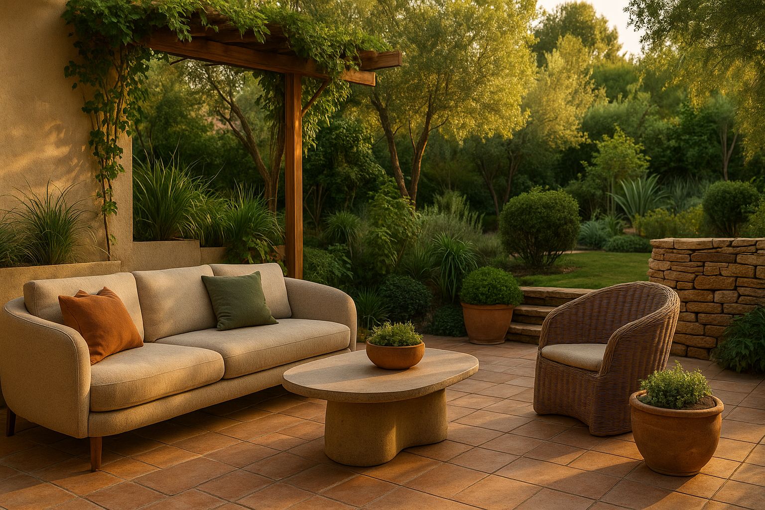
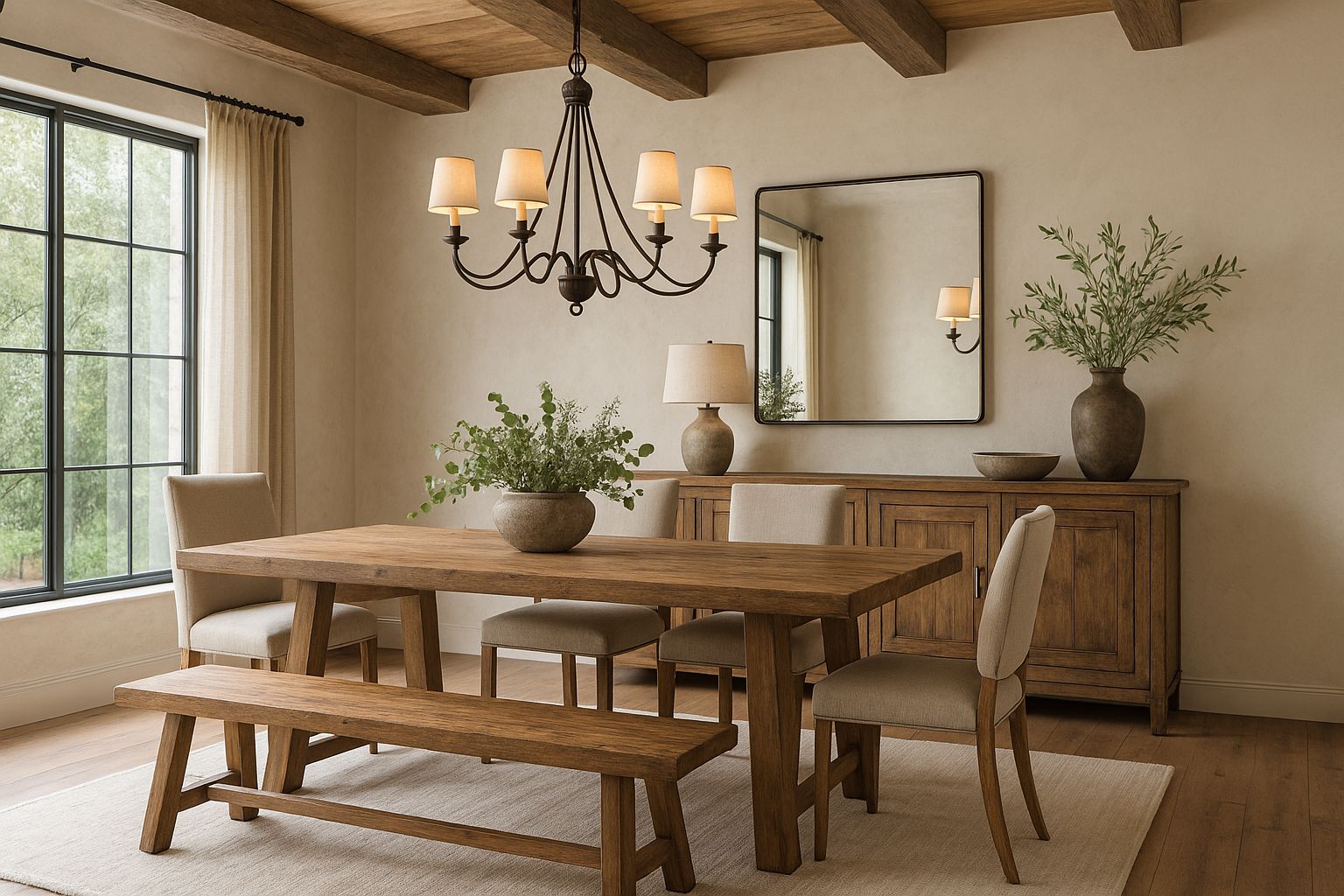
- Warm Beige: Neutral colors remain a timeless choice for bedrooms, and in 2026, warm beige is particularly popular. This color exudes a sense of coziness and tranquility, making it perfect for a serene bedroom environment. Warm beige can be used as a wall color or in textiles and furniture, offering a versatile base that complements various design styles.
Incorporating Relaxing Colors in Your Bedroom
Now that we’ve explored the top relaxing colors for 2026, let’s discuss how you can incorporate these hues into your bedroom. The key to creating a peaceful space lies in thoughtful design choices that reflect your personal style while prioritizing comfort and relaxation.
- Choosing the Right Wall Color
The wall color sets the tone for the entire bedroom, so it’s important to choose a shade that promotes relaxation. For a calming effect, consider painting your walls in muted greens, soft blues, or warm beige. These colors create a serene backdrop that allows other elements of your bedroom to shine.
If you’re hesitant about committing to a full room in one color, consider using an accent wall. For example, you could paint one wall in a soft blue or lavender while keeping the other walls neutral. This approach adds visual interest without overwhelming the space.
- Layering with Textiles
Textiles play a crucial role in the overall ambiance of a bedroom. To enhance the relaxing vibe, choose bedding, curtains, and rugs in soothing colors like pale pink, lavender, or muted greens. Layering different textures—such as soft linens, wool throws, and plush rugs—adds depth and comfort to the space.
For a cohesive look, consider matching your textiles with the wall color. For example, if you’ve chosen a warm beige for the walls, opt for bedding in a complementary shade like ivory or cream. This creates a harmonious, monochromatic palette that feels both luxurious and restful.
- Adding Natural Elements
Incorporating natural elements into your bedroom design can further enhance the calming effects of your chosen color palette. Wooden furniture, rattan baskets, and potted plants all contribute to a soothing, nature-inspired environment.
If you’ve chosen muted greens for your walls, complement the color with wooden furniture and plenty of greenery. This not only ties the room together but also brings the outside in, reinforcing the connection to nature that these colors evoke.
- Accent Pieces and Decor
Accent pieces and decor are the finishing touches that pull a room together. In a bedroom designed for relaxation, choose decor that complements your color scheme without overwhelming the space. Soft pastel throw pillows, delicate artwork, and minimalist lamps in coordinating hues can add a personal touch while maintaining the room’s serene atmosphere.
For instance, if your bedroom features soft blues, consider adding silver or glass accents for a touch of elegance. If you’ve opted for pale pink, gold or brass accents can add warmth and sophistication.
Trending Earthy Tones for Modern Bedrooms
As we move further into 2026, the trend towards natural, grounding colors continues to gain momentum. Earthy tones are becoming the go-to choice for those looking to create a modern yet comforting bedroom space. These colors, inspired by the natural world, bring warmth, depth, and a sense of calm to any room. In this section, we’ll explore why earthy tones are so popular in 2026, highlight some of the most trending earthy colors for bedrooms, and offer design ideas on how to incorporate these tones into your space.
Why Earthy Tones Are Taking Over in 2026
The appeal of earthy tones lies in their ability to create a connection between the indoors and the natural world. In an increasingly digital and fast-paced world, people are craving spaces that offer a sense of grounding and tranquility. Earthy colors—such as terracotta, olive green, and warm beige—evoke the warmth of the earth, the serenity of a forest, and the comfort of natural materials.
These colors are versatile and timeless, making them a perfect choice for modern bedrooms. They can be used as a backdrop for various design styles, from minimalist to bohemian, and can be paired with a range of other colors and textures to create a cohesive and inviting space.
Popular Earthy Colors for 2026 Bedrooms
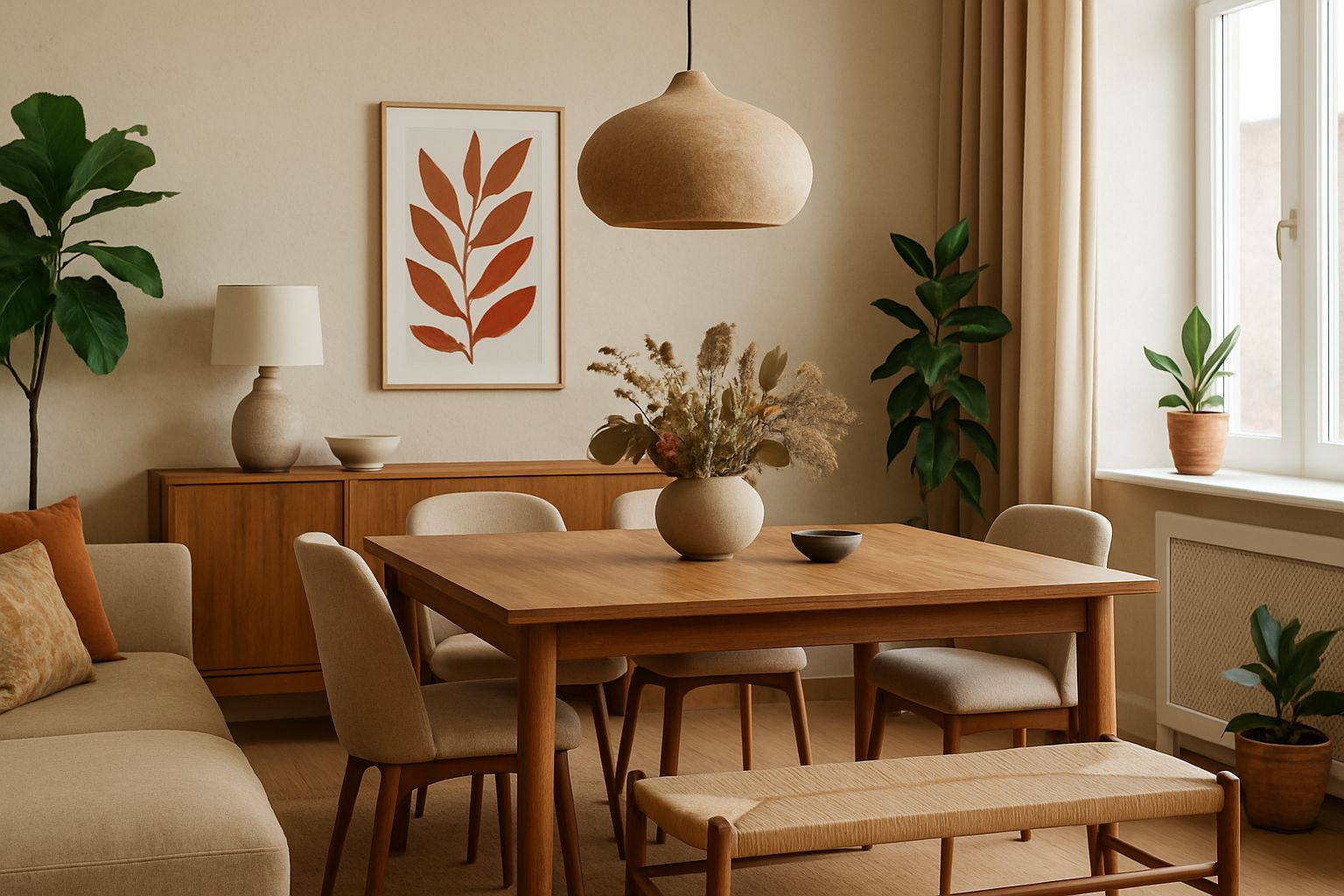
- Terracotta: This rich, warm color is reminiscent of sunbaked clay and desert landscapes. Terracotta is perfect for adding warmth and depth to a bedroom, especially when used as an accent wall or in decor elements like throw pillows or rugs. It pairs beautifully with neutral tones, such as beige or cream, as well as with other earthy colors like olive green.
- Olive Green: Olive green is a versatile and sophisticated color that brings a touch of nature indoors. It’s a muted, earthy shade that works well in both traditional and modern settings. Olive green can be used as a wall color, in bedding, or even in furniture pieces like an upholstered headboard. It pairs well with other earthy tones, such as terracotta and warm browns, as well as with natural materials like wood and stone.
- Warm Beige: As mentioned earlier, warm beige is a timeless choice for bedrooms. In 2026, this color continues to be popular for its ability to create a cozy and inviting atmosphere. Warm beige can be used as a wall color, in textiles, or as a base color to balance more vibrant earthy tones. It’s a versatile shade that complements a variety of design styles and can be easily updated with different accent colors and textures.
- Burnt Sienna: Burnt sienna is a deep, reddish-brown color that adds a sense of richness and warmth to a bedroom. This color is perfect for creating a cozy, intimate space. It works well as an accent color, whether in a statement wall or in smaller decor pieces like cushions or artwork. Burnt sienna pairs beautifully with other earthy tones, as well as with metallic accents like gold or brass.
Soft Pastel Bedroom Ideas for a Tranquil Space
As we continue exploring the bedroom color trends of 2026, soft pastels emerge as another significant trend. These gentle hues are perfect for creating a tranquil and serene space, ideal for rest and relaxation. Soft pastels have a timeless appeal, blending effortlessly into various design styles, from modern minimalist to cozy vintage. In this section, we’ll delve into the rise of soft pastels in 2026, highlight the top pastel colors for bedrooms, and offer styling tips to help you create a peaceful, pastel-hued retreat.
The Rise of Soft Pastels in 2026 Interior Design
Soft pastels have always held a special place in the world of interior design, known for their ability to create light, airy spaces that feel both fresh and inviting. In 2026, these colors are more popular than ever, particularly in bedroom design. The growing trend towards creating spaces that promote well-being and relaxation has led to a resurgence of these calming, soothing shades.
One of the reasons for the popularity of soft pastels is their versatility. These colors can be used as the main palette for a room or as accent colors to add subtle touches of color to a neutral space. Soft pastels are also incredibly adaptable, working well with a wide range of other colors, from deep, earthy tones to bright, vibrant hues.
In 2026, the trend is to use pastels in a sophisticated and understated way, moving away from the overly sweet or saccharine associations of the past. Instead, pastels are being used to create serene, elegant spaces that feel modern and grown-up.
Top Soft Pastel Colors for Bedrooms
- Blush Pink: Blush pink has been a favorite in interior design for several years, and it continues to be a popular choice for bedrooms in 2026. This soft, muted pink is perfect for creating a warm and inviting space. Blush pink works beautifully as a wall color, but it can also be used in textiles and decor to add a subtle touch of color. It pairs well with neutral tones like beige or gray and can be combined with metallic accents for a touch of glamour.
- Mint Green: Mint green is a fresh, cool color that brings a sense of calm and tranquility to a bedroom. This pastel shade is ideal for creating a light and airy space that feels peaceful and inviting. Mint green can be used on walls, in bedding, or in decor pieces like lamps or rugs. It pairs well with other pastels, like blush pink or soft yellow, and can also be combined with natural materials like wood or rattan for a more organic look.
- Powder Blue: Powder blue is a classic choice for creating a serene bedroom. This soft, light blue has a calming effect, making it perfect for a space dedicated to rest and relaxation. Powder blue can be used as a wall color or in textiles like bedding or curtains. It pairs beautifully with white or gray for a clean, fresh look, but can also be combined with deeper blues or greens for a more layered, sophisticated palette.
- Lavender: Lavender, with its subtle purple undertones, is another popular pastel for 2026 bedrooms. This color is both calming and elegant, making it an excellent choice for a peaceful retreat. Lavender works well on walls, but it can also be used in smaller doses, like in throw pillows or artwork. It pairs beautifully with other pastels, as well as with metallics like silver or chrome, for a modern, chic look.
- Soft Peach: Soft peach is a warm, inviting pastel that adds a touch of sweetness to a bedroom without being overpowering. This color is perfect for creating a cozy, welcoming space. Soft peach works well as an accent color, whether on a feature wall or in decor pieces like cushions or lampshades. It pairs beautifully with neutrals like beige or cream and can be combined with other pastels for a soft, harmonious palette.
Styling Tips for a Pastel Bedroom
Now that we’ve highlighted the top soft pastel colors for 2026, let’s explore some styling tips to help you create a tranquil, pastel-hued bedroom. Whether you’re looking to make a bold statement or simply add a touch of color, these tips will guide you in designing a space that feels both stylish and serene.
- Layering Pastels for Depth and Interest
One of the best ways to use pastels in a bedroom is to layer different shades for depth and visual interest. Start with a base color, like blush pink or powder blue, and then add accents in complementary pastels, such as mint green or soft peach. This creates a harmonious, multi-dimensional look that feels cohesive and well-balanced.
For example, if you choose powder blue as your wall color, you could add blush pink bedding, mint green throw pillows, and soft peach curtains. This layering technique not only adds interest to the space but also ensures that the room feels cozy and inviting.
- Balancing Pastels with Neutrals
While pastels are beautiful on their own, they can be even more effective when balanced with neutral tones. Pairing pastels with neutrals like white, gray, or beige creates a sophisticated and timeless look. Neutrals help to ground the space, ensuring that the pastels don’t become overwhelming.
For instance, if you have a blush pink wall, consider using white or gray bedding to balance the color. You can then add pastel accents through decor pieces like rugs, cushions, or lampshades. This approach allows the pastels to shine without overpowering the room.
- Incorporating Textures for a Cozy Feel
Texture is an essential element in any bedroom design, and it’s especially important when working with pastels. Incorporating a variety of textures adds warmth and coziness to the space, making it feel more inviting. Consider mixing soft textiles like cotton or linen with richer materials like velvet or wool.
For example, if you have a pastel-colored bedspread, you could add a chunky knit throw or a velvet cushion in a complementary shade. This not only adds visual interest but also creates a tactile, cozy environment that’s perfect for relaxation.
- Adding Natural Elements
Natural elements, such as wood, rattan, or greenery, pair beautifully with pastels and enhance the calming effect of these colors. Incorporating natural materials into your pastel bedroom design adds warmth and a sense of tranquility.
Consider adding wooden furniture, like a bed frame or a dresser, to contrast with pastel walls or bedding. You could also introduce rattan baskets or a jute rug for a touch of texture. Adding plants or flowers in soft pastel tones can also bring life and freshness to the space.
- Keeping It Simple
When working with pastels, sometimes less is more. A minimalist approach allows the colors to stand out and creates a clean, serene environment. Opt for a simple color palette with one or two pastel shades and keep decor to a minimum.
For example, if you’ve chosen mint green as your main color, you could keep the rest of the room neutral with white or light gray accents. Add a few carefully selected decor pieces, like a pastel-colored vase or a piece of artwork, to enhance the space without overwhelming it.
Combining Earthy Tones and Pastels in 2026 Bedrooms
As we explore the bedroom color trends of 2026, one of the most exciting developments is the combination of earthy tones and soft pastels. These two color palettes, while seemingly different, can be harmoniously blended to create a balanced, modern, and stylish bedroom. In this section, we’ll discuss how to combine earthy tones and pastels effectively, showcase successful color combinations, and provide practical tips for incorporating these palettes into your bedroom decor.
The Perfect Balance: Earthy Tones and Pastels
The combination of earthy tones and pastels is all about balance. Earthy tones bring warmth, depth, and a connection to nature, while pastels add lightness, softness, and a sense of calm. When these two palettes are combined, they create a space that feels grounded yet airy, cozy yet refreshing.
One of the key principles in combining these colors is to let one palette take the lead while the other complements it. For example, you might choose earthy tones as the dominant colors in the room, with pastels serving as accents. Alternatively, you could reverse this, with pastels taking center stage and earthy tones providing contrast and warmth.
Color Combinations That Work
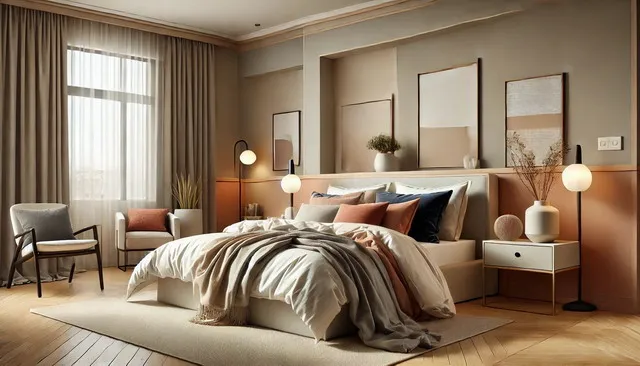
- Terracotta and Blush Pink: Terracotta’s rich, warm hue pairs beautifully with the softness of blush pink. This combination creates a warm, inviting space that feels both modern and romantic. Use terracotta for larger elements like walls or furniture, and add blush pink in smaller doses through bedding or decor.
- Olive Green and Lavender: Olive green’s muted, earthy tone contrasts nicely with the cool, calming effect of lavender. This pairing creates a serene, nature-inspired space that feels both fresh and grounded. Olive green works well on walls or in furniture, while lavender can be introduced through textiles or accessories.
- Warm Beige and Powder Blue: Warm beige is a versatile, neutral tone that pairs beautifully with the cool, calming effect of powder blue. This combination is perfect for creating a balanced, serene space. Use warm beige as the base color for walls or furniture, and add powder blue through bedding, curtains, or decor.
- Burnt Sienna and Soft Peach: Burnt sienna’s deep, earthy tone pairs well with the gentle warmth of soft peach. This combination creates a cozy, inviting space that feels both sophisticated and welcoming. Use burnt sienna as an accent color on a feature wall or in decor, and balance it with soft peach in textiles or smaller accessories.
Practical Application in Bedroom Decor: Combining Earthy Tones and Pastels
Now that we’ve explored the theory behind combining earthy tones and pastels, it’s time to put that knowledge into practice. This section will guide you through practical applications of these color combinations in various elements of bedroom decor, from walls and furniture to textiles and accessories. Whether you’re planning a complete bedroom makeover or just looking to refresh your space, these tips will help you create a cohesive, balanced, and stylish look that embodies the 2026 trends.
Walls: Setting the Tone
The color of your walls is the foundation of your bedroom’s design, and it sets the tone for the entire space. When combining earthy tones and pastels, you have several options for how to approach your wall color:
- Dominant Earthy Walls with Pastel Accents: If you prefer a more grounded, cozy feel, choose an earthy tone like terracotta, olive green, or warm beige for your walls. These colors create a warm and inviting backdrop that makes the room feel intimate and restful. To incorporate pastels, use them as accent colors in decor pieces, such as artwork, lamps, or bedding. For example, a terracotta wall paired with blush pink bedding and soft peach accents creates a harmonious and stylish look.
- Pastel Walls with Earthy Accents: For a lighter, more airy feel, opt for pastel wall colors like powder blue, mint green, or blush pink. These colors brighten the space and make it feel more open and serene. Earthy tones can then be introduced through furniture, textiles, and accessories. For instance, powder blue walls paired with a wooden bed frame, olive green cushions, and a burnt sienna throw create a balanced and refreshing atmosphere.
- Feature Walls: If you’re hesitant to commit fully to one color palette, consider creating a feature wall in an earthy tone, while keeping the other walls in a soft pastel shade. This approach adds visual interest and allows you to experiment with both palettes without overwhelming the space. For example, an olive green feature wall behind the bed can be complemented by pale pink or lavender on the remaining walls.
Furniture: Anchoring the Space
Furniture plays a crucial role in bringing together the earthy and pastel color palettes. When selecting furniture, consider both the color and the material to ensure they complement the overall design:
- Wooden Furniture: Natural wood tones are a perfect match for earthy colors and can also complement pastels beautifully. A wooden bed frame, dresser, or nightstand adds warmth and texture to the space, anchoring the room in a natural, organic feel. Pair wooden furniture with pastel textiles or decor to soften the look.
- Upholstered Furniture: If you’re looking to introduce more color through furniture, consider upholstered pieces in either earthy tones or pastels. For example, a blush pink upholstered headboard can add a touch of elegance and softness to a room dominated by earthy colors. Alternatively, an olive green armchair can serve as a statement piece in a pastel-colored room.
- Mix and Match: Don’t be afraid to mix and match furniture pieces in both earthy and pastel tones. A warm beige bed frame can be paired with pastel-colored bedside tables or a terracotta bench at the foot of the bed. This eclectic approach adds character and ensures that both color palettes are well-represented in the room.
Textiles: Adding Layers of Comfort
Textiles are one of the easiest and most effective ways to incorporate both earthy tones and pastels into your bedroom. From bedding to curtains to rugs, textiles can tie together the color scheme and add layers of comfort to the space:
- Bedding: Start with a base layer in a neutral or pastel shade, such as soft blue or pale pink. Then, layer on additional elements in earthy tones, like a terracotta throw blanket or olive green cushions. This creates a cozy, inviting bed that feels both luxurious and restful.
- Curtains and Rugs: Curtains and rugs are great opportunities to introduce color and texture into your bedroom. Opt for curtains in a soft pastel shade to allow light to filter through and brighten the space. A rug in a deeper earthy tone can ground the room and add warmth underfoot. For example, blush pink curtains paired with a warm beige rug create a balanced, serene environment.
- Layering Textures: To add depth and interest, mix different textures within your textiles. Combine smooth cotton sheets with a chunky knit throw or a velvet cushion in complementary colors. The variety of textures will make the room feel more layered and inviting, enhancing the overall aesthetic.
Accessories: The Finishing Touches
Accessories are the final touch that brings the entire room together. They offer a chance to introduce pops of color, add personality, and complete the design:
- Artwork: Choose artwork that reflects the color scheme of your room. For example, a piece featuring earthy landscapes or abstract designs in soft pastels can tie together the wall color and other decor elements. Art is also a great way to introduce a new color into the mix, adding an unexpected pop that enhances the overall design.
- Lighting: Lamps and lighting fixtures can also contribute to the color palette. A lamp with a terracotta or blush pink base can add warmth and complement the room’s colors. Consider soft, warm lighting to enhance the cozy atmosphere created by the earthy tones and pastels.
- Decorative Items: Small decorative items like vases, candles, and cushions are perfect for adding pops of color. Opt for items in complementary shades to your main color scheme. For example, if your room features olive green and soft peach, choose accessories in similar tones or add a touch of gold or brass for a sophisticated finish.
The Power of Balance
Ultimately, the key to successfully combining earthy tones and pastels in your bedroom is balance. Whether you choose to emphasize one palette over the other or strive for an even mix, the goal is to create a space that feels harmonious and reflective of your personal style. By carefully selecting colors, textures, and accessories, you can design a bedroom that embodies the 2026 trends while also providing a tranquil retreat from the outside world.
Accent Wall Ideas for 2026 Bedrooms
An accent wall is a fantastic way to add character and depth to a bedroom without overwhelming the space. In 2026, the trend is to use accent walls creatively, incorporating both earthy tones and pastels to create a striking yet serene focal point. In this section, we’ll explore the role of accent walls in bedroom design, suggest top colors for accent walls in 2026, and offer creative techniques to make your accent wall stand out.
The Role of Accent Walls in Bedroom Design
An accent wall is a single wall in a room that’s painted or decorated differently from the others. It serves as a focal point, drawing the eye and adding interest to the space. In a bedroom, the accent wall is typically behind the bed, but it can also be any wall that you want to highlight.
Accent walls are a great way to introduce bold colors or patterns without committing to them throughout the entire room. They allow you to experiment with color in a controlled way, making them perfect for those who want to embrace the 2026 trends of earthy tones and pastels without overwhelming their space.
Top Accent Wall Colors for 2026
- Deep Earth Tones: For a dramatic and cozy effect, consider using deep earth tones like terracotta, burnt sienna, or olive green for your accent wall. These colors create a warm and inviting focal point that anchors the room. Pair them with neutral or pastel tones on the other walls to create balance and contrast.
- Soft Pastels: If you prefer a lighter, more airy feel, opt for a soft pastel shade like blush pink, powder blue, or mint green for your accent wall. These colors add a subtle touch of color without overwhelming the space. A pastel accent wall can brighten up the room and create a serene, calming atmosphere.
- Warm Neutrals: Warm neutrals like warm beige or soft gray are also popular choices for accent walls in 2026. These colors provide a sophisticated backdrop that can be easily paired with both earthy tones and pastels in the rest of the room. A neutral accent wall is versatile and timeless, allowing you to update the room’s decor over time without needing to repaint.
Creative Accent Wall Techniques
- Ombre Effects: Ombre walls, where the color gradually transitions from light to dark (or vice versa), are a trendy way to add depth and interest to an accent wall. You can create an ombre effect using earthy tones that fade into pastels, or vice versa. For example, start with a deep terracotta at the base of the wall and gradually transition to a soft blush pink at the top. This technique adds a dynamic and visually appealing element to the room.
- Textured Paints: Another way to make your accent wall stand out is by using textured paints or finishes. Consider adding a faux finish that mimics natural materials like stone or plaster, in earthy tones like olive green or warm beige. Textured walls add depth and richness, making the room feel more sophisticated and cozy.
- Wallpaper: Wallpaper is a fantastic option for creating an accent wall that’s both stylish and unique. In 2026, look for wallpapers in earthy tones or soft pastels with patterns that complement your overall color scheme. Floral patterns in soft pastels or geometric designs in warm earth tones can add character and charm to your bedroom.
- Mixed Media: For a truly unique accent wall, consider a mixed-media approach. Combine paint with materials like wood paneling, fabric, or even tile to create a multi-dimensional focal point. For example, you could create a half-wall of wood paneling in a warm, earthy tone, with the upper half painted in a complementary pastel shade. This approach adds texture and visual interest, making your bedroom truly one-of-a-kind.
Bedroom Color Schemes for Couples in 2026
Designing a bedroom for couples can be a challenge, especially when it comes to selecting colors that appeal to both partners. The goal is to find a color scheme that strikes a balance between both individuals’ tastes while creating a harmonious and relaxing environment. In 2026, the trend is to use a mix of neutral palettes with accents of earthy tones and pastels that cater to different preferences. This section will guide you through choosing the perfect color scheme for couples, suggest top color combinations, and offer design tips for creating a harmonious shared space.
Finding the Perfect Balance for Shared Spaces
When designing a bedroom for couples, it’s essential to consider both partners’ preferences and find a middle ground that satisfies everyone. Earthy tones and pastels are perfect for this, as they offer a wide range of options that can be mixed and matched to create a balanced and inviting space.
Start by discussing your favorite colors and identifying any common ground. If one partner prefers cooler tones like blues and greens, while the other leans towards warmer colors like terracotta or peach, try to find a way to incorporate both. For example, you could choose a neutral base color like warm beige or soft gray and then add accents in both cool and warm tones.
Top Color Schemes for Couples
- Neutral Base with Earthy and Pastel Accents: A neutral base color, such as soft gray or warm beige, provides a versatile backdrop that can accommodate both earthy tones and pastels. For instance, a soft gray wall paired with a combination of olive green cushions and blush pink throws creates a balanced and inviting space that appeals to both partners.
- Blues and Earthy Tones: If one partner prefers cooler tones, consider using a soft blue as the main color and adding earthy accents in shades like terracotta or burnt sienna. This combination creates a serene and grounded environment that satisfies both preferences. For example, powder blue walls paired with a terracotta bedspread and wooden furniture create a harmonious and stylish bedroom.
- Pastels with Warm Neutrals: For a softer, more romantic look, consider using pastels like blush pink or lavender combined with warm neutrals like warm beige or soft brown. This color scheme is perfect for couples who want a cozy, intimate space. For instance, blush pink walls paired with a warm beige headboard and gold accents create a sophisticated and inviting atmosphere.
Design Tips for a Harmonious Bedroom
- Incorporate Personal Touches: To ensure that both partners feel represented in the space, incorporate personal touches that reflect each person’s style. This could be through artwork, decor pieces, or even textiles that hold sentimental value. Personalizing the space helps create a bedroom that feels like a true retreat for both partners.
- Use Symmetry: Symmetry is a powerful tool in design, especially in a shared space like a couple’s bedroom. Use matching bedside tables, lamps, or cushions to create a balanced and harmonious look. Symmetry not only adds visual appeal but also helps create a sense of equality and partnership in the space.
- Mix and Match: Don’t be afraid to mix and match different styles and colors. Combining different elements, such as a modern bed frame with vintage decor or earthy tones with pastel accents, adds character and ensures that both partners’ tastes are reflected in the room. The key is to find common threads that tie the different elements together, such as complementary colors or similar textures.
- Focus on Comfort: Above all, the bedroom should be a comfortable and restful space for both partners. Choose textiles that feel luxurious and inviting, invest in quality bedding, and ensure that the lighting is soft and soothing. A comfortable bedroom is a shared space where both partners can relax and unwind.
Conclusion
As we look forward to 2026, bedroom color trends are evolving to reflect a growing desire for spaces that promote relaxation, comfort, and well-being. From the calming effects of soft pastels to the grounding qualities of earthy tones, these color trends offer endless possibilities for creating a bedroom that feels both stylish and serene. Whether you’re drawn to the soothing hues of lavender and mint green or the warm embrace of terracotta and olive green, there’s a trend that’s perfect for you.
By thoughtfully combining these color palettes, incorporating textures, and paying attention to balance, you can create a bedroom that not only looks beautiful but also feels like a true sanctuary. Whether you’re designing a room for yourself, your family, or a shared space with a partner, these trends will help you create a space that’s modern, timeless, and truly reflective of your personal style.
As you embark on your bedroom redesign in 2026, remember that the most important element is how the space makes you feel. After all, your bedroom is your retreat, a place to recharge and find peace. With the right colors, textures, and design choices, you can create a space that’s not only on-trend but also perfectly tailored to your needs and preferences. Happy decorating!