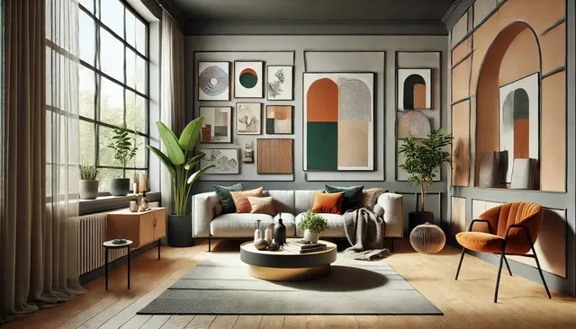
The trends this year are defined by a harmonious blend of earthy tones, soft pastels, and bold accents, each bringing its unique influence to the design landscape. Earthy tones offer a grounding presence, connecting us to the natural world and providing a sense of warmth and stability. Soft pastels, with their calming and soothing qualities, create serene spaces that promote relaxation and mental clarity. Meanwhile, bold accent colors are being used to inject personality, energy, and vibrancy into interiors, allowing homeowners to express their individuality.
As we move into 2026, the world of interior design is embracing a profound shift towards creating spaces that prioritize comfort, well-being, and a deep connection to nature. This year, more than ever, the colors we choose to surround ourselves with are playing a crucial role in shaping the atmosphere and energy of our homes. Interior color trends for 2026 are not just about aesthetics; they’re about creating environments that support a balanced, mindful lifestyle.
In addition to these color trends, there’s a growing emphasis on sustainability and eco-friendly design choices. As more people become conscious of their environmental impact, the demand for natural, non-toxic paints and sustainable materials is on the rise. This shift towards eco-conscious design is not only better for the planet but also enhances the overall health and well-being of those living in these thoughtfully designed spaces.
Whether you’re planning a complete home makeover or simply looking to refresh a single room, the color trends of 2026 offer a wealth of inspiration. From creating cozy, earthy havens to embracing the lightness of pastels or the drama of bold accents, this guide will explore the key trends and provide practical advice on how to bring them into your home. As you journey through these pages, you’ll discover how to use color to transform your space into a sanctuary that reflects your personal style and supports your well-being.
Top Earthy Tones for 2026 Interiors
As we approach 2026, the world of interior design is seeing a profound shift towards colors that evoke a deep connection to nature. Earthy tones are taking center stage, offering a palette that is as versatile as it is comforting. These shades, inspired by the natural world, are more than just a trend—they represent a movement towards creating spaces that feel grounded, serene, and sustainable. In this section, we’ll explore why earthy tones are dominating the interior design landscape in 2026, highlight some of the most popular earthy colors, and provide practical advice on how to incorporate these hues throughout your home.
Why Earthy Tones Are Dominating in 2026
The appeal of earthy tones lies in their ability to bring the outdoors inside, creating a sense of warmth and grounding that is increasingly sought after in our fast-paced, technology-driven world. In 2026, this trend is driven by a collective yearning for spaces that offer solace, reconnect us with nature, and promote well-being. The COVID-19 pandemic and the subsequent shift towards spending more time at home have made us more conscious of our living environments. As a result, there’s been a growing desire to create interiors that are not only aesthetically pleasing but also nurturing and restful.
Earthy tones, such as terracotta, olive green, and deep browns, fulfill this need by providing a color palette that is both timeless and versatile. These colors are reminiscent of the earth, forests, and deserts, evoking a sense of stability and comfort. They are also incredibly adaptable, working well in a variety of design styles, from modern minimalism to rustic farmhouse. Moreover, earthy tones pair beautifully with other trending colors, such as soft pastels and bold accents, making them a perfect foundation for a cohesive and stylish interior.
In addition to their aesthetic appeal, earthy tones are also aligned with the growing emphasis on sustainability in interior design. These colors often complement natural materials like wood, stone, and clay, reinforcing the connection to nature and supporting eco-friendly design choices. As we move towards 2026, the integration of earthy tones in home interiors is not just a matter of style but also a reflection of our evolving values and priorities.
Popular Earthy Colors for Home Interiors
The year 2026 brings with it a rich and varied palette of earthy tones that are set to transform interiors. These colors range from deep, rich hues to softer, more muted shades, offering something for every taste and style. Here are some of the top earthy colors that will define home interiors in the coming year:
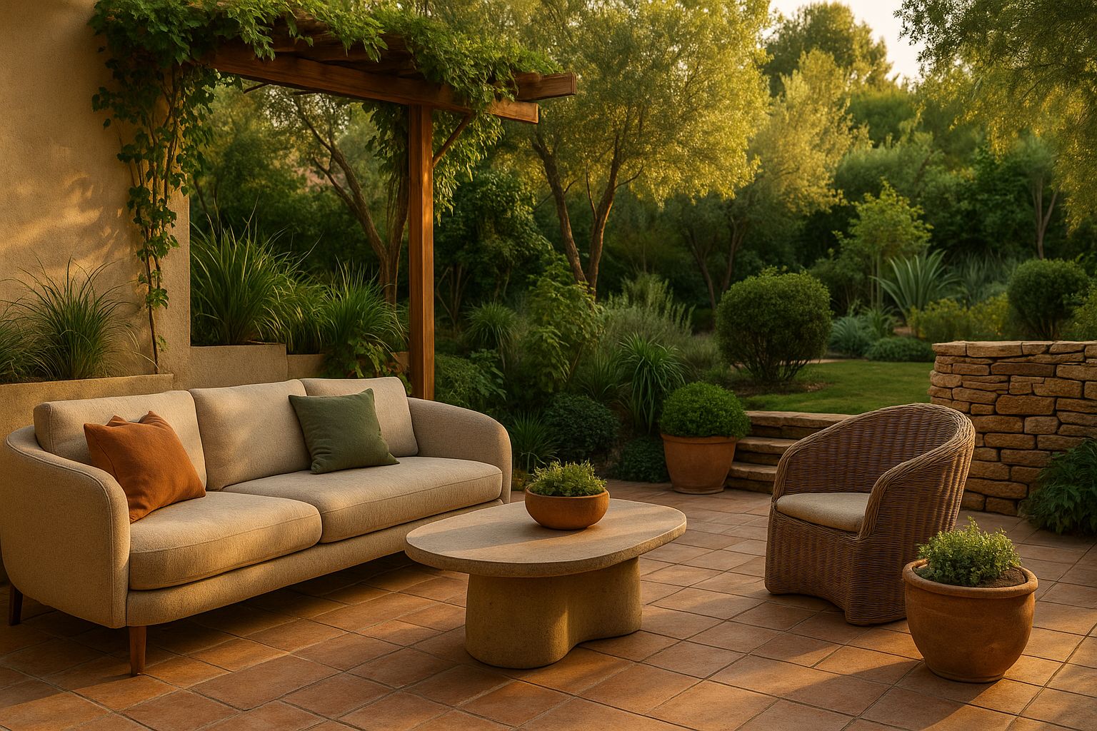
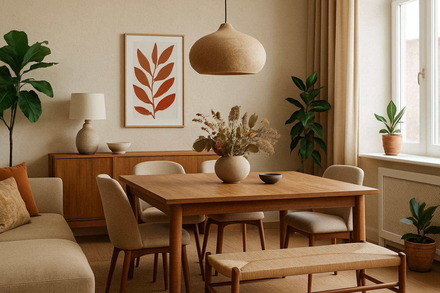
- Terracotta: Terracotta is one of the most iconic earthy tones, known for its warm, reddish-brown hue that evokes the feeling of sun-baked clay. In 2026, terracotta is making a strong comeback, particularly in living spaces and kitchens. This color brings warmth and depth to any room, creating a cozy and inviting atmosphere. Terracotta works beautifully on walls, floors, and even as an accent color in furniture and decor. It pairs well with other earthy tones like olive green and warm beige, as well as with soft pastels for a more balanced look.
- Olive Green: Olive green is another key player in the 2026 earthy color palette. This muted, sophisticated shade of green is perfect for creating a calming and grounded environment. Olive green works well in bedrooms, living rooms, and even kitchens, offering a versatile option that complements a wide range of materials and textures. It pairs particularly well with natural wood, leather, and other organic materials, reinforcing the connection to nature. Olive green can be used as a wall color, in textiles like curtains and bedding, or in accent pieces like cushions and lamps.
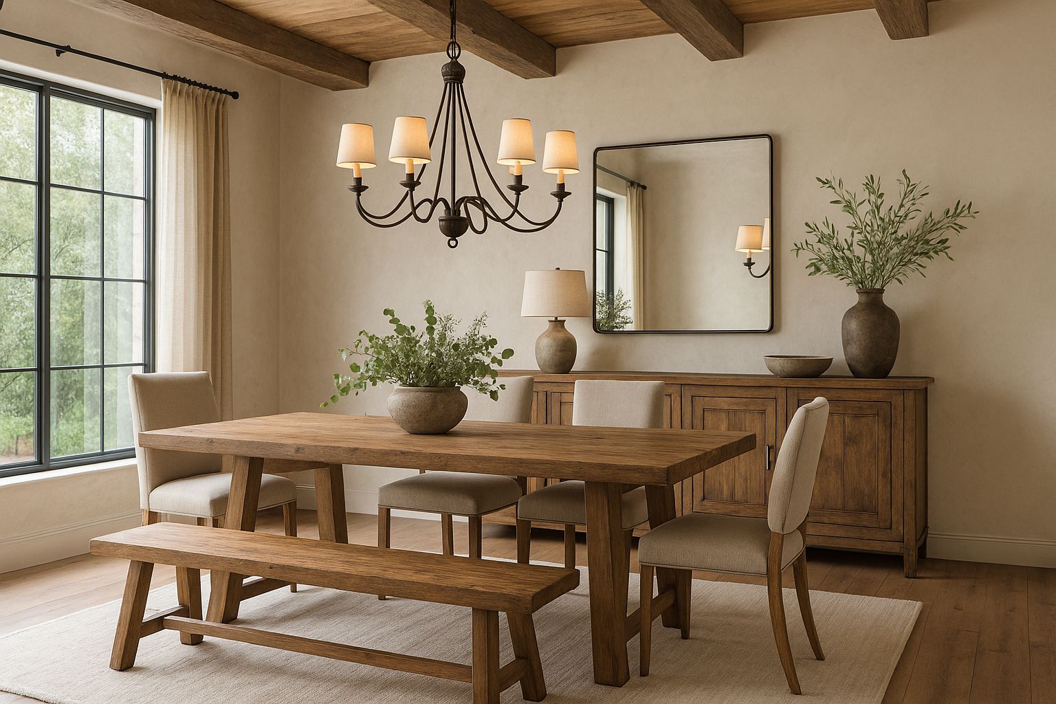
- Deep Browns: Deep, rich browns are timeless earthy tones that add a sense of warmth and luxury to any space. These colors, reminiscent of dark wood and rich soil, are perfect for creating a cozy and intimate atmosphere. In 2026, deep browns are being used in everything from wall colors to furniture, offering a versatile option that can anchor a room while allowing other colors to shine. Brown is particularly effective in creating contrast with lighter tones, such as warm beige or soft gray, and can be complemented by metallic accents like brass or gold for a more sophisticated look.
- Burnt Sienna: Burnt sienna is a deep, reddish-brown color that adds a touch of warmth and drama to any space. This color is perfect for creating a bold statement in living rooms, dining areas, or entryways. Burnt sienna pairs well with both warm and cool tones, making it a versatile choice for those looking to add a bit of color without overwhelming the space. It can be used as a feature wall color or in accent pieces like rugs, cushions, or artwork.
- Warm Beige: Warm beige is a versatile neutral that continues to be popular in 2026. This soft, earthy tone is perfect for creating a calm and inviting atmosphere. Warm beige works well in any room of the house, providing a neutral backdrop that allows other colors and textures to stand out. It pairs beautifully with both earthy tones and pastels, making it an ideal choice for those looking to create a balanced and harmonious interior.
Incorporating Earthy Tones Throughout the Home
Incorporating earthy tones into your home can be both simple and transformative. These colors are versatile enough to be used in any room, and they work well with a variety of materials and textures. Here are some tips on how to incorporate earthy tones throughout your home:
- Living Spaces
The living room is a great place to start incorporating earthy tones. Consider painting the walls in a rich terracotta or deep brown to create a warm and inviting space. If you prefer a lighter look, opt for olive green or warm beige as your main color, and then add terracotta or burnt sienna accents through cushions, throws, or artwork. Wooden furniture, leather sofas, and natural fiber rugs all complement these colors beautifully, adding texture and depth to the room.
- Kitchens
Kitchens are another area where earthy tones can make a big impact. Olive green cabinets paired with terracotta tiles or a deep brown backsplash create a grounded and sophisticated look. If you prefer a more subtle approach, consider using warm beige on the walls or countertops, with deep brown or burnt sienna accents in the form of bar stools, lighting fixtures, or kitchenware. These colors not only make the kitchen feel more connected to nature but also create a cozy, welcoming atmosphere that’s perfect for gathering with family and friends.
- Bedrooms
In the bedroom, earthy tones can help create a restful and relaxing environment. Olive green or warm beige walls provide a soothing backdrop, while deep brown or burnt sienna bedding and furniture add warmth and richness. Consider using terracotta accents in the form of cushions, lamps, or artwork to introduce a pop of color. Natural materials like linen, wool, and wood complement these colors and add to the overall sense of calm and comfort.
- Bathrooms
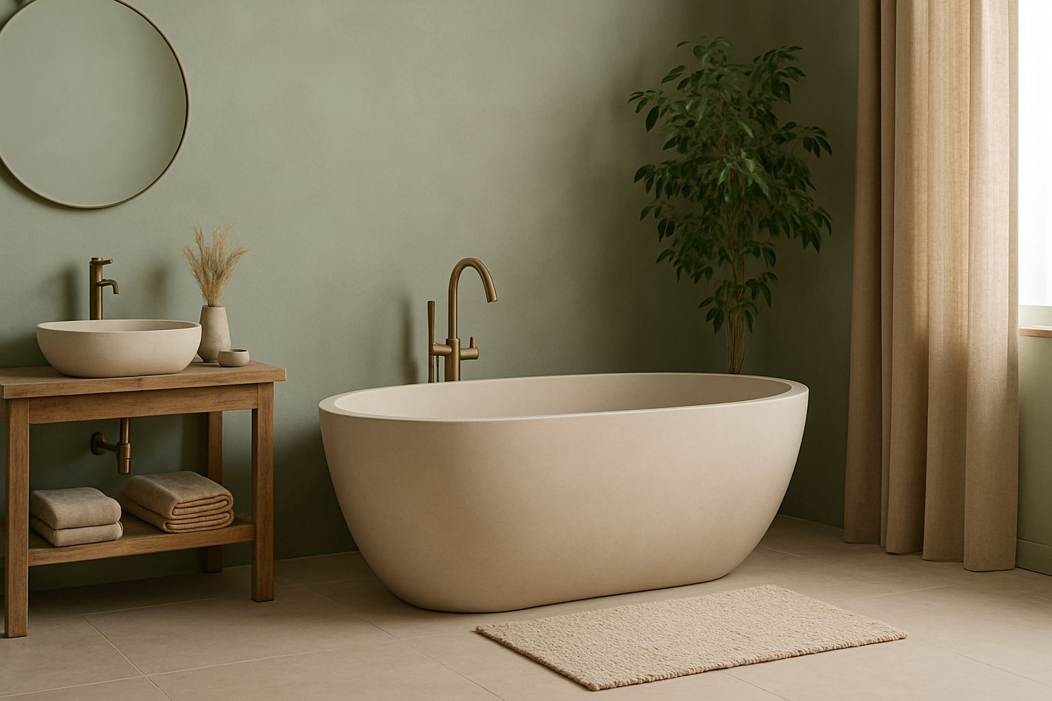
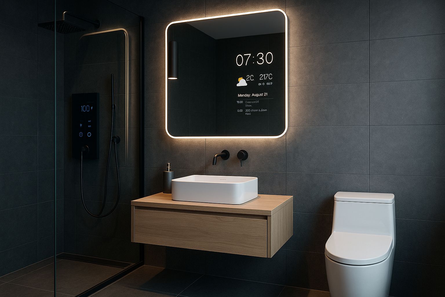
Bathrooms are often overlooked when it comes to color, but earthy tones can transform this space into a spa-like retreat. Consider using warm beige or olive green tiles, paired with deep brown or terracotta accents in the form of towels, rugs, or accessories. Wooden vanities, stone countertops, and natural fiber baskets all work well with these colors, creating a cohesive and relaxing environment.
- Entryways and Hallways
Entryways and hallways are perfect places to experiment with earthy tones. A deep brown or terracotta feature wall can make a bold statement, while warm beige or olive green can create a welcoming and inviting atmosphere. Use these colors in combination with natural materials like wood, stone, or rattan to create a cohesive look that sets the tone for the rest of your home.
Bedroom Color Trends 2026: Transform Your Space with These Stunning Shades
Soft Pastels for a Tranquil Home in 2026
As we move deeper into 2026, soft pastels are becoming increasingly popular for their ability to create light, airy, and serene spaces. These gentle hues are perfect for those looking to design a home that feels calm and inviting. In this section, we’ll explore why soft pastels are so appealing in modern interiors, highlight the top pastel shades for 2026, and provide tips on how to use these colors in different rooms of your home.
The Appeal of Soft Pastels in Modern Interiors
Soft pastels have a timeless appeal, offering a delicate touch of color that can brighten up any space without overwhelming it. In 2026, these colors are more popular than ever, particularly in interior design. The trend towards creating spaces that promote well-being and relaxation has led to a resurgence of these calming, soothing shades.
One of the reasons for the popularity of soft pastels is their versatility. These colors can be used as the main palette for a room or as accent colors to add subtle touches of color to a neutral space. Soft pastels are also incredibly adaptable, working well with a wide range of other colors, from deep, earthy tones to bright, vibrant hues.
In 2026, the trend is to use pastels in a sophisticated and understated way, moving away from the overly sweet or saccharine associations of the past. Instead, pastels are being used to create serene, elegant spaces that feel modern and grown-up.
Best Soft Pastel Shades for 2026
- Blush Pink: Blush pink has been a favorite in interior design for several years, and it continues to be a popular choice for 2026. This soft, muted pink is perfect for creating a warm and inviting space. Blush pink works beautifully as a wall color, but it can also be used in textiles and decor to add a subtle touch of color. It pairs well with neutral tones like beige or gray and can be combined with metallic accents for a touch of glamour.
- Mint Green: Mint green is a fresh, cool color that brings a sense of calm and tranquility to a room. This pastel shade is ideal for creating a light and airy space that feels peaceful and inviting. Mint green can be used on walls, in bedding, or in decor pieces like lamps or rugs. It pairs well with other pastels, like blush pink or soft yellow, and can also be combined with natural materials like wood or rattan for a more organic look.
- Powder Blue: Powder blue is a classic choice for creating a serene space. This soft, light blue has a calming effect, making it perfect for a space dedicated to rest and relaxation. Powder blue can be used as a wall color or in textiles like bedding or curtains. It pairs beautifully with white or gray for a clean, fresh look, but can also be combined with deeper blues or greens for a more layered, sophisticated palette.
- Lavender: Lavender, with its subtle purple undertones, is another popular pastel for 2026. This color is both calming and elegant, making it an excellent choice for a peaceful retreat. Lavender works well on walls, but it can also be used in smaller doses, like in throw pillows or artwork. It pairs beautifully with other pastels, as well as with metallics like silver or chrome, for a modern, chic look.
- Soft Peach: Soft peach is a warm, inviting pastel that adds a touch of sweetness to a space without being overpowering. This color is perfect for creating a cozy, welcoming environment. Soft peach works well as an accent color, whether on a feature wall or in decor pieces like cushions or lampshades. It pairs beautifully with neutrals like beige or cream and can be combined with other pastels for a soft, harmonious palette.
How to Use Soft Pastels in Different Spaces
- Living Rooms
Soft pastels are perfect for creating a light and airy living room. Consider using blush pink or powder blue as your main wall color, then add accents in complementary pastels like mint green or lavender. Soft pastel furniture, such as a blush pink sofa or powder blue armchair, can add a touch of color without overwhelming the space. Natural materials like wood or rattan complement these colors beautifully, adding texture and warmth to the room.
- Bedrooms
In the bedroom, soft pastels can create a serene and restful environment. Mint green or lavender walls provide a calming backdrop, while blush pink or soft peach bedding adds warmth and comfort. Consider using pastel accents in the form of cushions, throws, or curtains to add layers of color and texture. Metallic accents, like a silver lamp or gold picture frame, can add a touch of sophistication to the space.
- Kitchens
Kitchens are another great place to incorporate soft pastels. Mint green cabinets or a powder blue backsplash can add a pop of color without overwhelming the space. Consider using soft pastel accessories, like dishware or small appliances, to tie the look together. These colors not only brighten up the kitchen but also create a calm and inviting atmosphere that’s perfect for cooking and entertaining.
- Bathrooms
In the bathroom, soft pastels can create a spa-like atmosphere. Powder blue or lavender tiles paired with soft peach or blush pink towels create a calming and cohesive look. Consider using metallic accents, like a chrome faucet or a silver mirror, to add a touch of luxury to the space. Natural materials like stone or wood can add warmth and texture, creating a serene and relaxing environment.
- Workspaces
In a workspace, soft pastels can help create a calm and focused environment. Consider using mint green or powder blue on the walls to create a soothing backdrop. Soft pastel accessories, like a blush pink desk lamp or a lavender chair, can add a touch of color without being distracting. These colors not only create a pleasant working environment but also help promote focus and productivity.
By thoughtfully incorporating soft pastels and earthy tones into your home, you can create a space that is not only on-trend but also reflective of your personal style and needs. Whether you’re looking to create a serene retreat or a cozy, inviting space, these 2026 color trends offer endless possibilities for transforming your interior.
Living Room Color Palettes 2026: Refresh Your Space with Trendy Combinations
Bold Accent Colors to Watch in 2026
As we continue exploring the interior color trends for 2026, bold accent colors are making a strong statement in homes across the globe. While earthy tones and soft pastels set the foundation for tranquil and grounding spaces, bold colors are being used to inject energy, personality, and vibrancy into interiors. In this section, we’ll dive into the rising popularity of bold accent colors, highlight the top shades to watch for in 2026, and offer creative ways to incorporate these striking hues into your home.
Making a Statement with Bold Colors
In 2026, interior design is embracing a sense of individuality and expression, with bold accent colors leading the charge. These colors are not just about making a space look good—they’re about creating a mood, drawing attention, and adding depth to a room. Whether used sparingly or in larger swathes, bold colors have the power to transform a space from ordinary to extraordinary.
The appeal of bold colors lies in their ability to serve as focal points within a room. When used strategically, these colors can highlight architectural features, add contrast, and bring a dynamic edge to a space. Bold accent colors are particularly effective in rooms that serve as gathering spaces, such as living rooms, dining areas, and kitchens, where a vibrant atmosphere can enhance social interactions.
Moreover, in a world where personal expression is increasingly valued, bold colors offer a way to infuse a home with character and uniqueness. They allow homeowners to step away from the safety of neutrals and pastels, embracing colors that reflect their personality and style. As we move further into 2026, expect to see more homes adopting bold accents as a way to stand out and make a statement.
Top Bold Colors for 2026
- Cobalt Blue: Cobalt blue is a striking, deep blue that commands attention without overwhelming the space. This color is perfect for creating a bold statement in any room. It pairs beautifully with white or soft gray for a crisp, modern look, but can also be combined with earthy tones like terracotta or warm beige for a more balanced and grounded feel. Cobalt blue is particularly effective in accent walls, cabinetry, or statement furniture pieces like a velvet sofa or armchair.
- Deep Emerald: Deep emerald green is a rich, luxurious color that adds depth and sophistication to any interior. This bold shade works well in both traditional and contemporary settings, offering a versatile option that can be adapted to various design styles. Deep emerald pairs beautifully with gold or brass accents, adding a touch of elegance to the space. Consider using this color in a dining room, where it can create a dramatic backdrop, or in a living room as a feature wall or in velvet drapery.
- Mustard Yellow: Mustard yellow is a warm, vibrant color that brings energy and warmth to a room. This bold shade is perfect for creating a focal point in spaces like kitchens, living rooms, or home offices. Mustard yellow pairs well with neutrals like gray or white, as well as with deep browns or navy blue for a more grounded look. Consider using mustard yellow in accent furniture, such as a chair or side table, or in decor pieces like cushions, throws, or artwork.
- Rich Burgundy: Burgundy is a deep, wine-red color that exudes warmth and luxury. This bold shade is perfect for creating a cozy, intimate atmosphere in spaces like bedrooms, living rooms, or dining areas. Burgundy pairs beautifully with warm neutrals like beige or cream, as well as with metallic accents like gold or brass. Consider using burgundy in accent walls, upholstered furniture, or rich, textured fabrics like velvet or silk.
- Charcoal Black: Charcoal black is a bold, dramatic color that adds a modern, edgy feel to any space. This color is perfect for those looking to make a strong statement without resorting to bright colors. Charcoal black pairs well with a variety of other colors, including warm neutrals, soft pastels, and even other bold shades like cobalt blue or deep emerald. Use charcoal black in accent walls, cabinetry, or in furniture pieces like a sleek, modern coffee table or bookshelf.
Creative Ways to Use Bold Colors
Incorporating bold colors into your home can be a fun and rewarding way to update your space. Whether you’re looking to make a big impact or just add a touch of color, there are plenty of creative ways to use these striking hues.
- Accent Walls
One of the most popular ways to incorporate bold colors is through accent walls. An accent wall in a bold color like cobalt blue or deep emerald can create a striking focal point in a room. This technique is particularly effective in living rooms, dining areas, or bedrooms, where the bold color can serve as a backdrop for furniture, artwork, or decor. To avoid overwhelming the space, keep the other walls neutral and let the accent wall take center stage.
- Statement Furniture
Bold colors can also be introduced through statement furniture pieces. A deep emerald velvet sofa, a mustard yellow armchair, or a cobalt blue coffee table can add a pop of color and become a conversation piece in the room. When choosing bold-colored furniture, consider the surrounding color scheme to ensure that the piece complements rather than clashes with the rest of the decor.
- Bold Cabinetry
In the kitchen or bathroom, bold cabinetry can create a dramatic and modern look. Cobalt blue or charcoal black cabinets paired with light countertops and backsplashes can create a striking contrast, while deep emerald or mustard yellow cabinets can add warmth and richness. To keep the look cohesive, consider using metallic hardware in finishes like brass or gold, which pair beautifully with bold colors.
- Accessories and Decor
For those who prefer a more subtle approach, bold colors can be introduced through accessories and decor. Cushions, throws, rugs, artwork, and vases in bold shades like burgundy or mustard yellow can add pops of color without overwhelming the space. This approach is also ideal for those who like to change their decor frequently, as accessories can be easily swapped out to update the look.
- Bold Doors and Trim
Another creative way to use bold colors is by painting interior doors or trim in a striking hue. A deep emerald door in an otherwise neutral hallway, or mustard yellow trim around windows and doors, can add unexpected color and interest to a space. This technique works well in homes with a neutral or monochromatic color scheme, where the bold color can stand out without clashing with other elements.
Sustainable and Eco-Friendly Color Choices for 2026
As we move further into 2026, the emphasis on sustainability in interior design continues to grow. Homeowners are increasingly seeking out eco-friendly and non-toxic options for their homes, and this includes the colors they choose for their interiors. In this section, we’ll explore the shift towards sustainable and eco-friendly color choices in 2026, discuss the benefits of natural and non-toxic paints, and provide practical advice on how to incorporate these colors into your home.
The Shift Towards Eco-Conscious Design
The demand for sustainable and eco-friendly products has been steadily rising over the past few years, and this trend is now making its way into the realm of interior design. In 2026, homeowners are more conscious than ever about the environmental impact of their choices, and this is reflected in the growing popularity of sustainable materials, energy-efficient appliances, and, of course, eco-friendly colors.
Choosing sustainable colors goes beyond simply picking a shade that looks good—it’s about selecting paints and finishes that are safe for both the environment and the people living in the home. This includes using paints that are free from harmful chemicals, such as volatile organic compounds (VOCs), and opting for colors that are derived from natural pigments.
In addition to being better for the environment, sustainable color choices often align with the broader design trend of bringing nature indoors. Earthy tones, soft pastels, and natural, muted shades are all popular choices in 2026, as they not only look beautiful but also create a sense of calm and connection to the natural world.
Natural and Non-Toxic Paints in Trending Colors
One of the most significant shifts in 2026 is the move towards natural and non-toxic paints. These paints are made from natural ingredients, such as clay, lime, and plant-based oils, and are free from the harmful chemicals found in conventional paints. They are not only better for the environment but also for indoor air quality, making them a healthier choice for your home.
Here are some of the trending colors for 2026 that are available in natural and non-toxic paints:
- Clay Beige: A soft, warm beige derived from natural clay, this color is perfect for creating a neutral, earthy backdrop in any room. It pairs well with other earthy tones, as well as with soft pastels for a balanced and calming look.
- Eucalyptus Green: This muted green shade is inspired by the leaves of the eucalyptus tree and is perfect for creating a serene, nature-inspired space. Eucalyptus green works well in bedrooms, living rooms, and bathrooms, where it can add a touch of tranquility.
- Terra Cotta: Derived from natural earth pigments, terra cotta is a warm, reddish-brown color that adds depth and warmth to a room. This color is perfect for creating a cozy, inviting atmosphere in living rooms or dining areas.
- Natural White: A timeless and versatile color, natural white is made from natural lime and clay. It provides a clean, fresh backdrop that pairs beautifully with both bold colors and earthy tones. Natural white is ideal for any room in the house, offering a neutral canvas that allows other elements to shine.
- Slate Gray: Slate gray is a cool, muted shade made from natural minerals. This color is perfect for creating a modern, sophisticated look in kitchens, bathrooms, or living spaces. It pairs well with both warm and cool tones, making it a versatile choice for any design scheme.
Incorporating Eco-Friendly Colors into Your Home
Choosing sustainable and eco-friendly colors for your home is easier than ever in 2026, thanks to the growing availability of natural and non-toxic paints. Here are some tips on how to incorporate these colors into your interior design:
- Start with the Walls
The walls are the largest surface in any room, making them the perfect place to start when incorporating eco-friendly colors. Consider using natural and non-toxic paints in trending colors like clay beige or eucalyptus green to create a calming and inviting atmosphere. These colors not only look beautiful but also contribute to a healthier indoor environment.
- Choose Sustainable Materials
When selecting furniture and decor, opt for sustainable materials that complement your eco-friendly color scheme. Wooden furniture, natural fiber rugs, and organic cotton textiles all pair beautifully with natural colors and help create a cohesive, eco-conscious design.
- Use Eco-Friendly Finishes
In addition to paint, consider using eco-friendly finishes like natural wood stains or plant-based varnishes. These finishes not only protect your furniture and decor but also enhance the natural beauty of the materials, creating a warm and inviting look.
- Bring Nature Indoors
Incorporating plants and natural elements into your design is a great way to complement your eco-friendly color scheme. Plants not only add color and texture but also improve indoor air quality, making them a perfect addition to any eco-conscious home.
- Think Beyond the Paint
Remember that eco-friendly color choices extend beyond just the paint on your walls. Consider the color and sustainability of everything in your home, from furniture and textiles to decor and accessories. By choosing products that are made from natural, sustainable materials and in colors that reflect the beauty of nature, you can create a home that is both stylish and environmentally friendly.
By thoughtfully incorporating bold accents and sustainable colors into your interior design, you can create a home that is both visually striking and environmentally conscious. Whether you’re looking to make a bold statement or simply create a calming, eco-friendly space, the color trends of 2026 offer endless possibilities for transforming your home.
Neutral Color Palettes for a Timeless 2026 Interior
Neutral color palettes have long been a staple in interior design, valued for their versatility, elegance, and ability to create a calming environment. As we move into 2026, these timeless hues continue to dominate, but with a modern twist. The focus is on warm, inviting neutrals that bring comfort and sophistication to any space. In this section, we’ll explore the enduring appeal of neutral tones, highlight the top neutral shades for 2026, and provide tips on how to create a cohesive, timeless look using these colors.
The Enduring Appeal of Neutral Tones
Neutral colors have a unique ability to adapt to different design styles and personal tastes. They serve as the perfect backdrop, allowing other design elements—such as furniture, artwork, and textiles—to shine. In 2026, the trend is moving towards warm, earthy neutrals that add depth and warmth to interiors, while still maintaining the calm and balance that neutrals are known for.
One of the reasons neutral tones remain so popular is their versatility. They can be easily layered, combined, or accented with bolder colors to create a variety of looks. Whether you’re going for a minimalist, Scandinavian-inspired space or a more traditional, cozy ambiance, neutral colors provide the foundation you need to build your desired aesthetic.
Moreover, neutral palettes are timeless. Unlike more vibrant or trendy colors, neutrals never go out of style. They offer longevity, making them a smart choice for those who want a look that will stand the test of time. In a world where design trends can change rapidly, neutrals provide a sense of stability and continuity.
Top Neutral Shades for 2026
- Warm Beige: Warm beige is a classic neutral that exudes comfort and warmth. In 2026, this color is taking center stage as the go-to choice for creating a cozy, inviting atmosphere. Warm beige works well in living rooms, bedrooms, and dining areas, providing a versatile backdrop that pairs beautifully with both earthy tones and soft pastels.
- Soft Gray: Soft gray is another timeless neutral that remains popular in 2026. This cool, calming shade is perfect for creating a serene environment, making it ideal for bedrooms and bathrooms. Soft gray pairs well with a variety of other colors, from deep blues and greens to warm beiges and blush pinks, offering endless possibilities for creating a cohesive look.
- Creamy White: Creamy white is a warm, inviting alternative to stark white, offering a softer, more approachable look. This color is perfect for those who want a clean, fresh aesthetic without the coldness that can sometimes accompany pure white. Creamy white works well in any room, providing a neutral canvas that allows other design elements to take center stage.
- Taupe: Taupe is a versatile, sophisticated neutral that falls somewhere between gray and beige. This color is perfect for creating a grounded, earthy look that still feels modern and fresh. Taupe works well in living spaces, where it can add depth and warmth, as well as in bedrooms and kitchens, where it creates a calm, cohesive environment.
- Greige: A blend of gray and beige, greige is a popular neutral for 2026. This color offers the best of both worlds, combining the warmth of beige with the coolness of gray. Greige is perfect for those who want a versatile, timeless color that can easily transition between different design styles. It works well in any room, from living spaces to kitchens to bathrooms.
Creating a Cohesive Look with Neutrals
Using neutral colors effectively requires careful consideration of layering, texture, and accent colors. Here are some tips on how to create a cohesive, timeless look using neutral palettes:
- Layering Neutrals
One of the keys to creating a dynamic, interesting space with neutrals is to layer different shades and tones. Start with a base color, such as warm beige or soft gray, and then add lighter or darker shades within the same color family. For example, if your walls are painted in warm beige, consider using creamy white for the trim and a slightly darker taupe for the furniture. This layering adds depth and dimension to the space, preventing it from feeling flat or one-dimensional.
- Incorporating Texture
Texture is essential when working with neutrals, as it adds visual interest and richness to the space. Consider using a variety of materials and finishes, such as linen, wool, wood, and metal, to create a tactile, inviting environment. For example, in a living room with soft gray walls, you might incorporate a plush wool rug, a leather sofa, and a wooden coffee table. These textures not only enhance the overall aesthetic but also make the space feel more comfortable and lived-in.
- Adding Subtle Accents
While neutral palettes are all about subtlety, adding a few well-chosen accents can elevate the overall design. Consider incorporating accent colors that complement your neutral base. For instance, a soft blush pink throw pillow on a greige sofa, or a deep blue vase on a taupe side table, can add a touch of color without overwhelming the space. Metallic accents, such as brass or gold, also work well with neutrals, adding a touch of sophistication and elegance.
- Playing with Light and Shadow
Lighting plays a crucial role in how neutral colors are perceived. Natural light can bring out the warmth in beige tones or the coolness in gray, so it’s important to consider how your space is lit when choosing neutral colors. In rooms with lots of natural light, creamy whites and soft grays can create a bright, airy feel. In darker spaces, warmer neutrals like taupe or warm beige can add coziness and depth. Consider using a mix of lighting sources, such as table lamps, floor lamps, and overhead lighting, to create different moods and highlight various elements of the room.
- Embracing Simplicity
The beauty of neutral palettes lies in their simplicity. Don’t feel the need to overcomplicate the design—sometimes, less is more. A well-chosen neutral palette, paired with clean lines and minimal decor, can create a space that feels both timeless and modern. This approach works particularly well in spaces like bedrooms and bathrooms, where a sense of calm and relaxation is essential.
Combining Earthy Tones and Soft Pastels for a Balanced Interior
As we delve deeper into the color trends of 2026, one of the most exciting developments is the harmonious blending of earthy tones and soft pastels. These two color palettes, while distinct, can be skillfully combined to create interiors that are both balanced and visually captivating. In this section, we’ll explore the art of combining earthy tones with soft pastels, highlight successful color combinations, and offer practical tips for applying these palettes throughout your home.
The Perfect Blend of Warm and Cool
The combination of earthy tones and soft pastels is all about finding the right balance between warmth and coolness. Earthy tones like terracotta, olive green, and warm beige bring depth, warmth, and a connection to nature, while soft pastels such as blush pink, mint green, and powder blue add lightness, softness, and a sense of calm. When these two palettes are combined, the result is a space that feels both grounded and airy, cozy and fresh.
One of the keys to successfully blending these colors is to let one palette take the lead while the other serves as a complementary accent. For example, you might choose earthy tones as the dominant colors in a room, with soft pastels providing subtle highlights and accents. Alternatively, you could reverse this, with pastels as the primary colors and earthy tones adding contrast and warmth.
Successful Color Combinations
- Terracotta and Blush Pink: Terracotta’s rich, warm hue pairs beautifully with the soft, romantic tones of blush pink. This combination is perfect for creating a cozy, inviting space that feels both modern and timeless. Use terracotta on walls or in larger furniture pieces, while blush pink can be introduced through textiles, artwork, or smaller decor items.
- Olive Green and Mint Green: Olive green, with its muted, earthy quality, contrasts nicely with the cool, fresh tones of mint green. This pairing works well in spaces like living rooms or bedrooms, where the combination of warm and cool tones creates a balanced, serene atmosphere. Consider using olive green in furniture or accent walls, with mint green in bedding, cushions, or rugs.
- Warm Beige and Powder Blue: Warm beige is a versatile neutral that pairs beautifully with the cool, calming effect of powder blue. This combination is ideal for creating a serene, sophisticated space, particularly in bedrooms or living rooms. Use warm beige as the base color, with powder blue accents in textiles, decor, or even as a feature wall.
- Burnt Sienna and Soft Peach: Burnt sienna’s deep, earthy tone is complemented by the gentle warmth of soft peach. This combination is perfect for creating a cozy, welcoming environment in spaces like dining rooms or entryways. Use burnt sienna in larger elements like walls or furniture, with soft peach in accessories, lighting, or smaller decor pieces.
How to Apply This Combination in Various Rooms
- Living Rooms
In the living room, start with an earthy tone like terracotta or olive green for the walls or larger furniture pieces, such as a sofa or armchair. Then, introduce soft pastels like blush pink or mint green through cushions, throws, or artwork. This combination creates a space that feels warm and inviting, yet light and airy. Consider adding natural materials like wood, rattan, or stone to further enhance the connection to nature.
- Bedrooms
In the bedroom, a warm beige wall color provides a calming backdrop, while powder blue bedding or curtains add a touch of coolness and serenity. For an added layer of warmth, incorporate accents in a deep earthy tone like burnt sienna through pillows, rugs, or a statement piece of furniture. The result is a balanced, restful space that promotes relaxation and comfort.
- Kitchens
Kitchens are a great place to experiment with color combinations. Consider using olive green cabinets paired with mint green tiles or backsplash. Add warmth with terracotta or burnt sienna accents in the form of kitchenware, bar stools, or even a statement wall. This combination creates a vibrant, yet harmonious kitchen that feels both modern and grounded.
- Bathrooms
In the bathroom, soft pastels like blush pink or mint green can be used on walls or in tiles, while earthy tones like warm beige or olive green can be introduced through cabinetry, flooring, or decor. This combination creates a spa-like atmosphere that feels both luxurious and calming. Consider adding metallic accents in gold or brass to enhance the overall look.
- Dining Rooms
In the dining room, a deep earthy tone like burnt sienna can be used on the walls or in a statement piece of furniture, such as a dining table or sideboard. Soft peach or blush pink can be introduced through dining chairs, table linens, or artwork. This combination creates a warm, inviting space that is perfect for gathering with family and friends.
Accent Wall Ideas and Techniques for 2026 Interiors
Accent walls have long been a popular way to add depth and character to a room, and in 2026, they remain a key trend in interior design. The focus this year is on using accent walls creatively, with an emphasis on color, texture, and unique finishes. In this section, we’ll explore the role of accent walls in modern interiors, highlight top colors and techniques for 2026, and provide tips on how to choose the right wall and style for your space.
The Role of Accent Walls in Modern Interiors
An accent wall is a powerful design tool that can transform a room without requiring a complete overhaul. By highlighting one wall with a different color, texture, or finish, you can create a focal point that draws the eye and adds visual interest. In 2026, accent walls are being used to make bold statements, add texture, and even define spaces within open-concept layouts.
The key to a successful accent wall is to choose a wall that naturally draws attention. This might be the wall behind a bed in a bedroom, the wall with a fireplace in a living room, or the wall behind the dining table in a dining room. Once you’ve chosen the right wall, the next step is to decide on the color or technique that best complements your overall design scheme.
Top Accent Wall Colors and Techniques for 2026
- Deep Earth Tones: Deep earthy tones like terracotta, olive green, or burnt sienna are perfect for creating a bold, warm accent wall. These colors add depth and richness to a space, making them ideal for living rooms, bedrooms, or dining areas. Pair these bold colors with neutral tones on the other walls to create a balanced, cohesive look.
- Soft Pastels: For a more subtle approach, consider using a soft pastel like blush pink, mint green, or powder blue for your accent wall. These colors add a touch of color without overwhelming the space, making them ideal for bedrooms, bathrooms, or even kitchens. Pastel accent walls work well with both neutral and earthy tones, providing a gentle contrast that enhances the overall design.
- Textured Finishes: Texture is a major trend in 2026, and accent walls are the perfect place to experiment with different finishes. Consider using textured paint, wallpaper, or materials like wood paneling, stone, or plaster to add depth and interest to your accent wall. Textured accent walls work well in any room, adding a tactile element that enhances the overall aesthetic.
- Ombre Effects: Ombre walls, where the color gradually transitions from light to dark (or vice versa), are a trendy way to add a dynamic element to your space. This technique works particularly well with bold colors like deep blue or green, as well as with pastels like blush pink or mint green. Ombre accent walls are ideal for bedrooms, living rooms, or entryways, where they can create a striking visual impact.
- Wallpaper: Wallpaper is making a big comeback in 2026, particularly in bold patterns and colors. Consider using a statement wallpaper on your accent wall to add personality and character to your space. From botanical prints to geometric designs, wallpaper offers endless possibilities for creating a unique, eye-catching accent wall.
How to Choose the Right Wall for an Accent
Choosing the right wall for an accent is crucial to the success of your design. Here are some tips to help you make the right choice:
- Consider the Room’s Focal Point
The best accent walls are those that highlight an existing focal point in the room. In a living room, this might be the wall with the fireplace or the wall where the TV is mounted. In a bedroom, it’s often the wall behind the bed. In a dining room, it might be the wall behind the dining table. By choosing a wall that already draws attention, you can enhance the natural flow of the room.
- Think About the Function of the Room
Consider how the room is used and what kind of atmosphere you want to create. In a bedroom, you might want a calming, serene accent wall in a soft pastel. In a living room, you might want a bold, dramatic accent wall in a deep earthy tone. The function of the room should guide your choice of color and style for the accent wall.
- Consider the Room’s Lighting
Lighting plays a key role in how colors are perceived. Before committing to an accent wall color, consider how the room is lit. Natural light can bring out the warmth in earthy tones or the coolness in pastels, so it’s important to test your chosen color in different lighting conditions. In rooms with lots of natural light, bolder colors can make a strong impact, while in darker rooms, lighter shades or textured finishes might be more appropriate.
- Balance the Design
If the room already has a lot of visual interest—such as bold furniture, colorful artwork, or intricate rugs—you might want to choose a more subtle accent wall. Conversely, if the room is relatively simple, a bold accent wall can add the visual interest that’s missing. The key is to balance the design so that the accent wall enhances rather than overwhelms the space.
- Experiment with Samples
Before making a final decision, try out different colors, textures, and finishes on your chosen wall. Paint samples, wallpaper swatches, and texture samples can help you visualize how the finished wall will look and feel. Don’t be afraid to experiment—sometimes, the most unexpected combinations can yield the best results.
Conclusion
As we look forward to 2026, interior color trends are evolving to reflect a growing desire for spaces that promote relaxation, comfort, and well-being. From the grounding qualities of earthy tones to the soothing effects of soft pastels, these color trends offer endless possibilities for creating interiors that are both stylish and serene.
Whether you’re drawn to the rich warmth of terracotta and olive green, the lightness of blush pink and powder blue, or the timeless elegance of neutral palettes, 2026’s color trends provide a versatile foundation for designing a home that reflects your personal style and needs. By thoughtfully combining these colors, incorporating textures, and paying attention to balance, you can create spaces that not only look beautiful but also feel like true sanctuaries.
As you embark on your interior design journey in 2026, remember that the most important element is how your home makes you feel. After all, your home is your refuge, a place to recharge and find peace. With the right colors, textures, and design choices, you can create a space that’s not only on-trend but also perfectly tailored to your lifestyle and well-being. Happy decorating!