The living room is often considered the heart of a home, serving as a space for relaxation and gathering. As 2026 approaches, the emerging color palettes will reflect a balance of vibrancy and tranquility, combining bold hues with calming neutrals. These choices cater to various tastes while also considering the psychological effects colors have on mood and atmosphere.
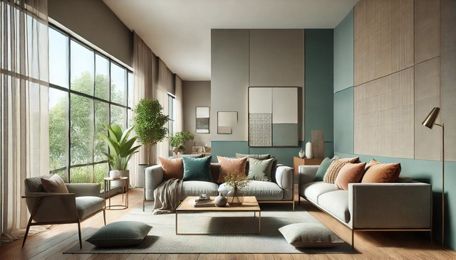
As individuals seek to create personalized environments, themes from nature and urban settings will inspire innovative designs. Homeowners will explore how textures and materials enhance color combinations, reflecting their personal styles and the architecture of their homes. Lighting will also play a crucial role, influencing how colors are perceived throughout different times of the day.
Key Takeaways
- Color palettes for 2026 emphasize a blend of bold colors with serene neutrals.
- Texture and lighting significantly impact the perception of color in living spaces.
- Personal style will drive the choice of colors, influenced by nature and urban trends.
Emerging Trends in Living Room Color Palettes for 2026
In 2026, living room color palettes will reflect significant influences from technology and a growing emphasis on sustainability. The integration of these themes will shape the aesthetic and emotional impact of living spaces.
Influence of Technology on Color Trends
Advancements in technology will significantly influence color trends in living rooms. Smart technology enables designers to create color palettes that respond to lighting conditions and user preferences. For instance, adaptive lighting systems can change the perception of colors throughout the day, enhancing the mood of the space.
Color selection tools powered by augmented reality will allow individuals to visualize how different shades will appear in their homes before making choices. Colors like deep blues and vibrant teals may gain popularity, as they resonate well with smart glass technology that controls light and glare.
Additionally, digital art installations will encourage bolder, more dynamic color combinations, including unexpected accents that bring a modern touch to living spaces.
Sustainability and Natural Hues
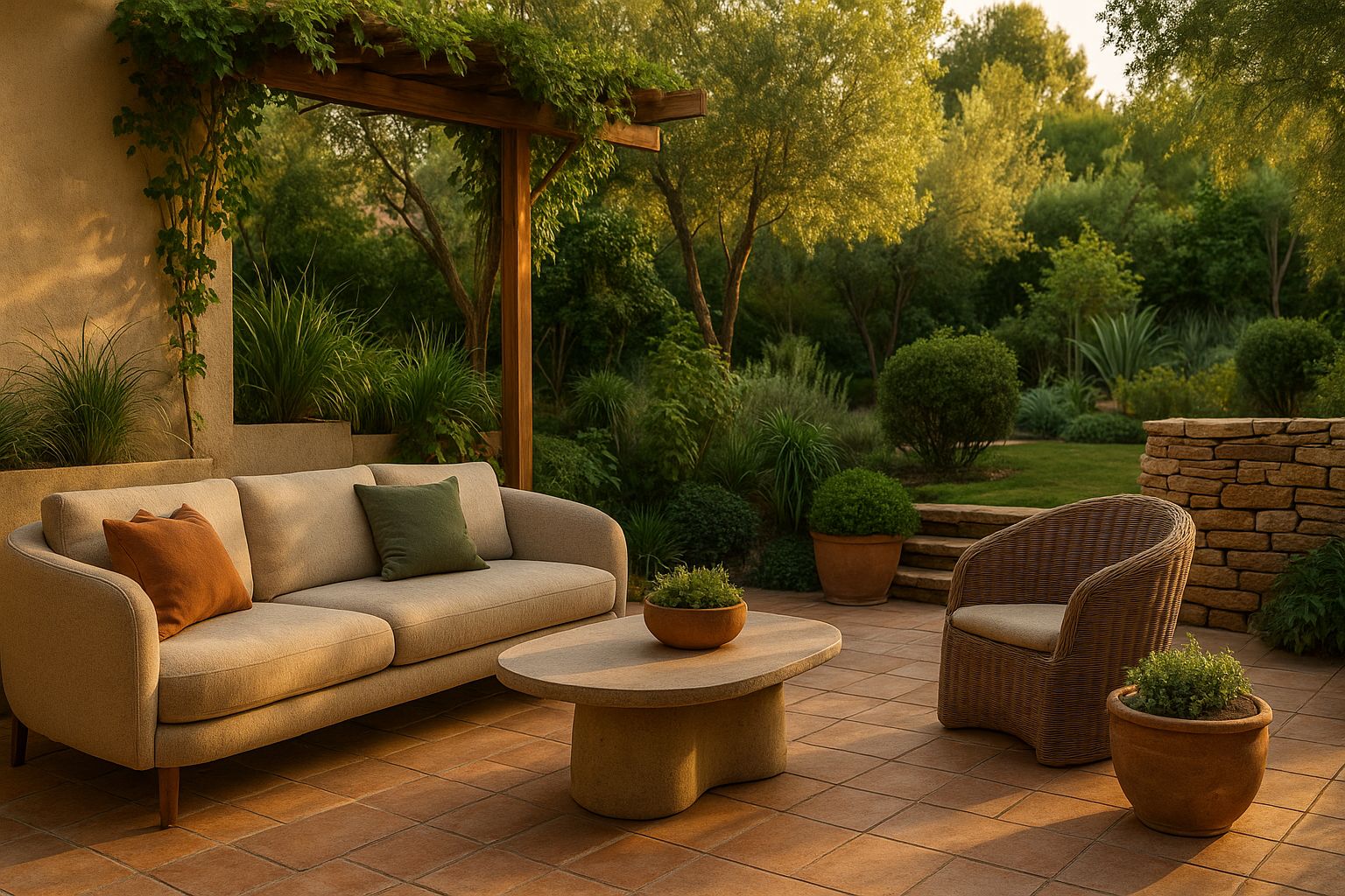
Sustainability will be a key consideration in 2026’s living room color palettes. Consumers increasingly prefer eco-friendly materials and paint, leading to a rise in organic, earthy tones. Colors such as soft greens, warm browns, and muted yellows will reflect a connection to nature, promoting a sense of tranquility.
Natural pigments, derived from sustainable sources, will gain traction among manufacturers. These pigments provide rich, deep colors without harmful chemicals.
Textured materials in these shades will add depth and warmth to living rooms. This trend aligns with the broader movement towards minimalism, where simplicity and the use of natural elements foster a calming environment. Emphasizing comfort and serenity will guide many homeowners in their color choices.
The Psychology of Color in Living Room Design
Color plays a pivotal role in shaping the atmosphere of a living room. It influences emotions, mood, and perception of space. Understanding these dynamics can guide thoughtful color choices to create desired effects.
Emotional Responses to Color
Different colors evoke distinct emotional responses. For example, blue often promotes calmness and serenity, making it suitable for relaxation areas. In contrast, warm hues like red and orange can stimulate energy and passion.
Green, associated with nature, brings a refreshing and balanced vibe, while yellow generally evokes happiness and optimism. The choice of color can affect not just mood but also social interactions, as certain colors may encourage or hinder communication.
Creating a harmonious palette that resonates with personal preferences enhances the living room experience, making it inviting and emotionally supportive.
Color and Spatial Perception
Color significantly affects how space is perceived. Lighter shades, such as whites and pastels, can make a living room feel larger and more open. They reflect light and create an airy atmosphere.
Conversely, darker colors tend to absorb light, creating a more intimate feel but potentially making spaces seem smaller.
Choosing a bold accent wall can serve as a focal point without overwhelming the space.
In smaller areas, selecting a monochromatic color scheme can also create a sense of continuity, enhancing the perception of spaciousness. These strategies help in not just beautifying the living area but also in optimizing its spatial characteristics.
Color Harmony and Theory Applications
Color harmony is essential in creating a visually appealing living room. It involves the strategic use of colors to establish balance and interest.
Key concepts of color theory include:
- Complementary Colors: Colors opposite each other on the color wheel, such as blue and orange. These provide contrast.
- Analogous Colors: Colors next to each other, like blue, teal, and green. They create a serene effect.
- Triadic Colors: Three evenly spaced colors on the wheel. This approach adds vibrancy, like red, yellow, and blue.
When applying these theories, consider the mood desired.
Color palettes for 2026 may lean toward:
- Warm neutrals: Beige, taupe, and soft whites that promote comfort.
- Bold accents: Rich jewel tones like emerald green or deep purple.
- Earthy tones: Terracotta and olive green to connect with nature.
It’s important to test colors in different lighting conditions. The same hue can appear different based on natural light or artificial sources.
Practical application includes using a 60-30-10 rule for color distribution:
- 60%: Dominant color (walls, large furniture)
- 30%: Secondary color (upholstery, curtains)
- 10%: Accent color (decorative items, art)
This method promotes a balanced look while allowing for personalization. Adjustments based on individual preferences can enhance the living room’s ambiance.
Popular Color Schemes and Combinations
This section explores trendy color schemes for living rooms in 2026, emphasizing specific combinations that create visually appealing environments. Understanding how different colors interact can enhance a room’s atmosphere.
Monochromatic and Analogous Schemes
Monochromatic schemes focus on variations of a single color. By incorporating different shades and tints, a cohesive and sophisticated look is achieved. For instance, various tones of blue can create a serene space, making it calming and inviting.
Analogous color schemes use colors that are next to each other on the color wheel. A combination of green, blue-green, and teal can evoke freshness and tranquility. This approach offers a harmonious feel while adding depth and interest.
In both cases, accents through textiles, artwork, or furniture can enhance the scheme further, keeping the design dynamic and engaging.
Complementary and Triadic Schemes
Complementary schemes involve using opposite colors on the color wheel. For example, pairing orange with blue creates a vibrant contrast, drawing attention and energy. This scheme is excellent for lively living areas, especially when accented with neutral tones.
Triadic schemes employ three equally spaced colors on the wheel, forming a balanced yet dynamic palette. A combination such as red, yellow, and blue offers variety while maintaining harmony. This bold approach can stimulate creativity and excitement in a space.
Strategic use of these color combinations can emphasize features and create a striking aesthetic suitable for modern living rooms.
Neutral Palettes: Beyond White and Beige
Neutral color palettes are evolving to include a wider range of shades that create warmth and depth in living spaces. These palettes now offer various options, including warm and cool neutrals, each serving distinct aesthetic purposes.
Warm Neutrals
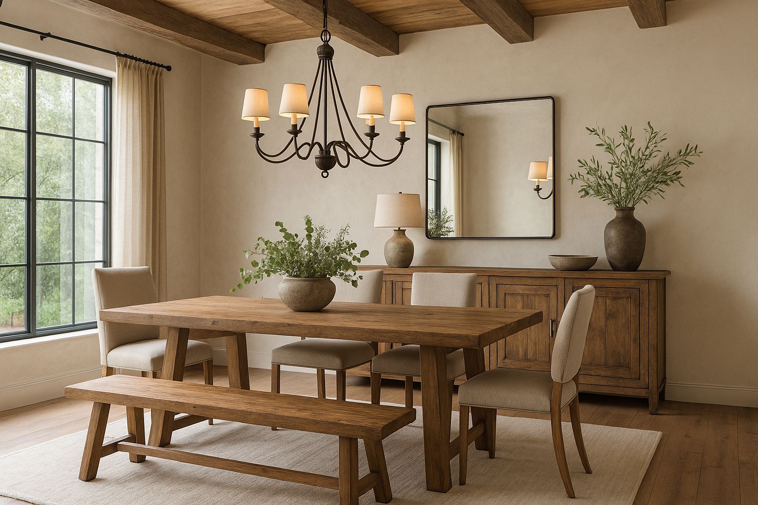
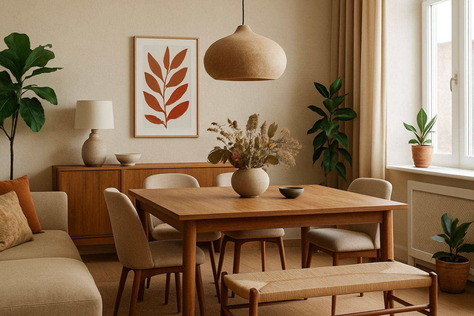
Warm neutrals encompass shades like taupe, sand, and soft greys with yellow undertones. These colors bring a sense of coziness and comfort. They work well in spaces designed for relaxation, such as living rooms.
Using warm neutrals can enhance natural light, making a room feel inviting. Pairing earth tones like terracotta or muted gold can create a harmonious blend.
Textiles in natural fibers enhance the warmth of these shades. Think of linen curtains, wool throws, and jute rugs. Together, they foster a serene atmosphere.
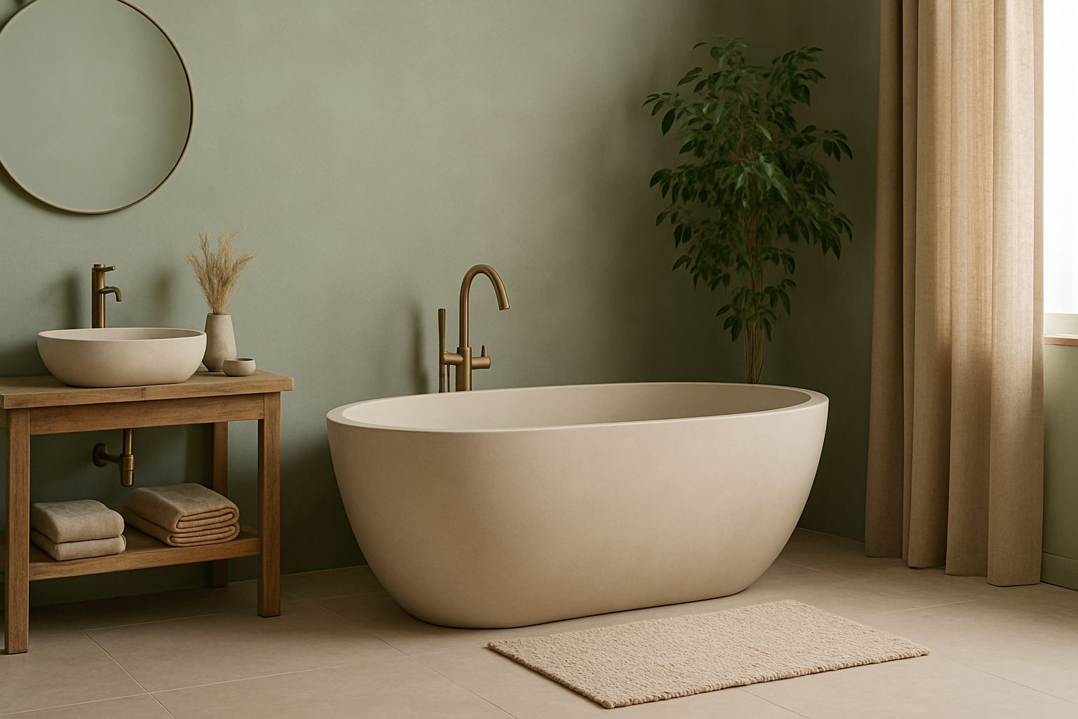
Cool Neutrals
Cool neutrals include colors like cool greys, icy blues, and soft greens. These shades provide a calming effect, making them perfect for modern or minimalist designs.
Cool neutrals can create a crisp and clean environment. They particularly shine when combined with accents in bolder colors like navy or deep emerald.
Incorporating materials such as glass and metal can elevate the look. For instance, chrome light fixtures or sleek furniture complements cool shades. This combination can achieve a sophisticated and airy feel in any living room.
Bold and Vibrant: Statement Colors in Living Rooms
Statement colors can transform a living room into a lively and expressive space. By utilizing bold hues and unique combinations, individuals can create an ambiance that reflects their personality and style. Accent walls and artistic palettes play crucial roles in this vibrant approach.
Accent Walls and Features
Accent walls serve as focal points in living rooms, offering opportunities to introduce bold colors without overwhelming the entire space. Popular choices for these walls include deep blues, rich greens, or even bright reds. These colors can be paired with lighter tones for balance.
Adding features like painted furniture or vibrant decor enhances the effect. Elements such as bold light fixtures, textured wallpapers, or oversized artwork can complement the accent wall. These choices create a visually interesting area, encouraging creativity.
Artistic and Expressive Palettes
Artistic palettes can be a fusion of various vibrant colors, bringing a dynamic feel to living rooms. Consider using contrasting colors, such as bright yellows paired with royal purples, to invoke energy and excitement.
Incorporating playful patterns into upholstered furniture or cushions can further enhance this effect. Patterns like geometric shapes or floral designs add layers of visual interest. Adding artwork that reflects these colors ensures a cohesive and expressive atmosphere that resonates with personal style.
Textures and Materials: Contributing to the Color Story
Textures and materials play a vital role in enhancing the color story within living room designs. They create depth and contrast, making color choices more dynamic.
Key Textures and Materials:
- Wood: Offers warmth and a natural element. It pairs well with earth tones and can accentuate bolder colors.
- Fabric: Soft furnishings like cushions and throws contribute to the color palette. Varied fabrics, such as velvet or linen, can impact the perception of color.
- Metal: Reflective surfaces can enhance brightness and vibrancy. Metals like brass or matte black can add sophistication or modernity.
- Stone: Natural stone adds texture and cool tones, balancing warmer colors. It creates a grounding effect in the room.
Incorporating a mix of these elements allows for a more layered and nuanced approach to color. For instance, pairing rich, deep hues with light fabrics can create an inviting atmosphere.
Careful selection of materials can also highlight certain colors. A glossy finish, for example, can make a color appear more vibrant, while a matte finish may soften it.
Ultimately, textures and materials work together to shape the overall impact of a color palette in a living room, influencing both mood and aesthetic appeal.
Lighting: Enhancing Colors and Moods in Living Spaces
Lighting plays a crucial role in defining the mood of a living space and enhancing its color palette. Different lighting types can dramatically alter how colors appear and affect the atmosphere of a room.
Types of Lighting:
- Ambient Lighting: Provides overall illumination. This is often achieved with ceiling fixtures or wall sconces.
- Task Lighting: Focused light for specific activities, using lamps or recessed lighting. It enhances functionality without overwhelming the color scheme.
- Accent Lighting: Highlights architectural features or decor elements. This adds depth and richness to the overall design.
Effects of Lighting on Colors:
- Warm Light (2700K-3000K): Creates a cozy atmosphere. It tends to emphasize warm colors like reds, oranges, and yellows.
- Cool Light (3500K-4100K): Offers a more energetic feel. This light enhances cooler colors, such as blues and greens, making them appear more vibrant.
- Natural Light: Varies throughout the day. It can transform the appearance of colors, with morning light being softer and afternoon light appearing brighter.
Tips for Effective Lighting:
- Layer Lighting: Combine ambient, task, and accent lighting for balance.
- Use Dimmer Switches: Allow adjustments to suit different moods and times of day.
- Consider Color Temperature: Choose light bulbs that align with the desired atmosphere.
By carefully selecting and combining these lighting types, one can significantly enhance both color and mood in living spaces.
Pantone’s Color of the Year and Its Influence
Pantone’s Color of the Year for 2026 is a key indicator of emerging trends in design and decor. This color often reflects cultural shifts and societal moods, influencing a wide range of industries.
The selection impacts various aspects of living room design. From furniture choices to wall paint, the Color of the Year serves as a foundation for inspiration.
Key Influences of Pantone’s Color:
- Furniture Design: Designers incorporate the color into upholstery and cabinetry.
- Wall Colors: Homeowners often paint accent walls in the chosen hue.
- Accessories: Decorative items such as cushions and artwork align with the trend.
The color can evoke specific feelings, influencing the atmosphere of a living space. For example, warmer tones may create a cozy environment, while cooler shades promote tranquility.
Interior designers and homeowners alike look to Pantone for guidance. This ensures that their choices remain contemporary and well-coordinated with broader design trends.
As 2026 approaches, attention to the chosen color’s applications will shape how living rooms are styled. It acts as a unifying element, connecting various design elements to foster harmony within the space.
Integrating Living Room Colors with Home Architecture
Choosing the right color palette for a living room involves considering the architectural style of the home. Different architectural styles often suggest specific color choices that enhance the overall aesthetic.
Modern Architecture:
For contemporary homes, neutral colors like whites, grays, and earth tones provide a clean backdrop. Accents in bold colors can create visual interest without overwhelming simplicity.
Traditional Architecture:
Classic designs can benefit from rich, deeper hues. Shades like navy blue, forest green, or burgundy often complement wood finishes and intricate moldings.
Farmhouse Style:
Light blues, soft greens, and light grays work well in spaces designed to evoke a cozy, rustic feel. These colors enhance natural light and create an inviting atmosphere.
Eclectic Styles:
For those who embrace varied elements, consider a mix of colors that reflect personal tastes. Coordinating bold accent colors with neutral walls can effectively tie different design aspects together.
When integrating colors, consider the following:
- Flow: Ensure color transitions between rooms are seamless.
- Natural Light: Observe how light impacts color perception throughout the day.
- Textures: Consider incorporating various textures to enhance color interactions.
Choosing colors that resonate with the home’s architecture creates a cohesive environment that feels intentional and inviting.
Best Practices for Personalizing Your Color Palette
Creating a personalized color palette for a living room can enhance its aesthetic and reflect individual style. Here are some effective practices to consider:
- Start with a Neutral Base
Choose a neutral color for walls and larger furniture pieces. This creates a flexible backdrop for adding color. - Choose a Focal Point
Identify a dominant color through a feature piece, such as artwork or a statement sofa. This will help anchor the color scheme. - Use the 60-30-10 Rule
- 60%: Dominant color (often the walls or largest furniture).
- 30%: Secondary color (like upholstery or drapes).
- 10%: Accent color (small accessories or art).
- Test with Samples
Paint swatches or fabric samples can help visualize color combinations in natural light. - Incorporate Textures
Different materials can enhance color perception. Mixing textures adds depth and interest. - Pay Attention to Lighting
Natural and artificial lighting can change how colors appear. Experiment with lighting options to see how they affect the palette. - Reflect Personal Style
Incorporate colors that resonate with emotions or memories. It should feel authentic and inviting. - Balance Warm and Cool Tones
Mixing temperature can create harmony. Pairing warm tones with cool can add interest without overwhelming the space.
By following these practices, individuals can create a living space that feels uniquely theirs.