As we move into 2025, the world of home decor is undergoing a transformative shift, with color playing a pivotal role in shaping the ambiance and style of our living spaces. Gone are the days of sterile whites and predictable neutrals dominating the design landscape. Instead, homeowners and designers alike are embracing a more dynamic, expressive palette that reflects both personal taste and broader cultural trends.
This year, color trends are about more than just aesthetics; they are a reflection of our desire for homes that not only look beautiful but also feel deeply connected to who we are and the world we inhabit. From the calming influence of nature-inspired greens to the luxurious appeal of metallics, the colors of 2025 offer a rich tapestry of options for those looking to refresh and renew their spaces.
In this article, we’ll explore the top color trends for 2025, diving into the hues that are set to define interiors in the coming year. Whether you’re drawn to the earthy warmth of terracotta, the serene elegance of soft pastels, or the bold vibrancy of accent colors, these trends provide a blueprint for creating a home that is both stylish and meaningful. Join us as we delve into the colors that will shape the homes of tomorrow, offering inspiration and insights for every room in your house.
Color Trends 2025: Top 10
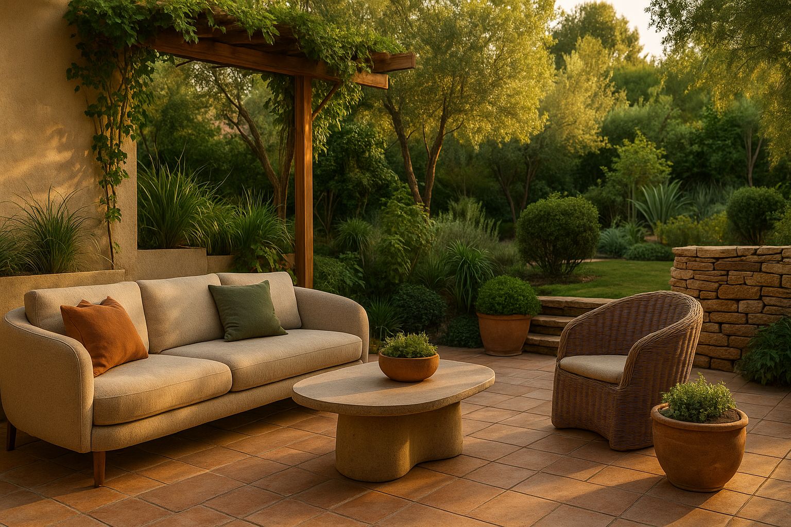
Earthy Tones for a Natural Look
As we step into 2025, one of the most prominent color trends in home decor is the embrace of earthy tones. These colors, inspired by the natural world, bring a sense of warmth, grounding, and connection to nature into our living spaces. From the deep, rich hues of terracotta to the subtle, calming shades of ochre and sage, earthy tones are making a significant impact in interior design, offering a palette that is both versatile and timeless.
Why Earthy Tones?
The appeal of earthy tones lies in their ability to create a harmonious and soothing environment. In a world where we are constantly bombarded with stimuli, these colors offer a retreat, a space where one can relax and unwind. The popularity of these tones is also a reflection of a broader societal shift towards sustainability and mindfulness. As more people seek to live in harmony with the environment, they are turning to colors that reflect this ethos.
Terracotta, for instance, is a color that has been around for centuries, used in pottery, flooring, and architecture. Its resurgence in home decor speaks to our collective desire to return to something elemental and enduring. Similarly, ochre, with its warm, golden undertones, evokes the feeling of sunlight filtering through autumn leaves, creating a cozy and inviting atmosphere.
Incorporating Earthy Tones in Different Rooms
One of the great strengths of earthy tones is their adaptability. They can be used in various rooms and paired with different styles, from rustic to modern.
- Living Room: In the living room, earthy tones can create a welcoming and comfortable space. A terracotta feature wall can add warmth, while ochre accents in cushions or throws can bring in a subtle vibrancy. Pair these with natural materials like wood and stone to enhance the organic feel.
- Bedroom: In the bedroom, earthy tones are perfect for creating a restful retreat. Soft shades of sage or clay can be used on the walls to evoke a sense of calm, while deeper hues like burnt sienna can be introduced through bedding or rugs for a touch of luxury.
- Kitchen: The kitchen is another space where earthy tones can shine. Consider using terracotta tiles for the backsplash or incorporating warm, natural wood tones in the cabinetry. These elements can make the kitchen feel more connected to the natural world, turning it into a space that is both functional and inviting.
Pairing Earthy Tones with Other Colors
While earthy tones are stunning on their own, they also pair beautifully with a range of other colors, allowing for endless possibilities in design.
- Neutrals: Pairing earthy tones with neutral colors like beige, cream, or soft grey can create a serene and balanced look. This combination works particularly well in minimalist or Scandinavian-inspired interiors, where the focus is on simplicity and functionality.
- Bold Colors: For those who want to make a statement, earthy tones can be combined with bolder colors like deep navy, forest green, or mustard yellow. This pairing can add depth and interest to a space, making it feel more dynamic and layered.
- Metallics: Earthy tones also work well with metallic accents, particularly warm metals like brass, copper, and gold. These metals can add a touch of elegance and sophistication, elevating the overall look of the space.
Soft Pastels for a Serene Ambiance
While earthy tones bring warmth and grounding, soft pastels are making a strong case for creating serene and tranquil spaces in 2025. These colors, characterized by their light, muted shades, are perfect for those looking to infuse their homes with a sense of calm and peace. From the gentle blush of pink to the soothing hues of baby blue and mint green, soft pastels are versatile and can be used in various ways to create a relaxed and inviting atmosphere.
The Rise of Soft Pastels
Soft pastels have always had a place in home decor, but in 2025, they are being embraced with renewed enthusiasm. This trend can be attributed to the growing desire for spaces that offer respite from the chaos of the outside world. As we continue to navigate the complexities of modern life, many are turning to these calming colors to create a sanctuary within their homes.
The appeal of soft pastels lies in their ability to evoke feelings of tranquility and well-being. Unlike bolder, more vibrant colors, pastels do not overwhelm the senses. Instead, they offer a gentle, soothing presence that can make a space feel airy and light. This quality makes them particularly well-suited for smaller rooms or spaces that lack natural light, as they can help to brighten and open up the area.
Incorporating Soft Pastels in Home Decor
Soft pastels can be incorporated into home decor in a variety of ways, depending on the desired effect.
- Walls: One of the most popular ways to use soft pastels is on the walls. A soft blush pink or a light lavender can create a romantic and dreamy ambiance in the bedroom, while a pale mint green or baby blue can bring a refreshing and calming vibe to the living room or bathroom.
- Furniture: Another way to introduce soft pastels is through furniture. A pastel-colored sofa or armchair can serve as a focal point in the living room, adding a touch of color without dominating the space. Similarly, pastel dining chairs or a painted dresser can bring a subtle pop of color to a neutral kitchen or dining area.
- Accessories: For those who prefer to keep their walls and furniture neutral, soft pastels can also be introduced through accessories. Cushions, throws, rugs, and curtains in pastel shades can add warmth and softness to a room, while still allowing for flexibility in changing the color scheme later on.
Pairing Soft Pastels with Other Colors
Soft pastels are incredibly versatile and can be paired with a range of other colors to create different effects.
- Whites and Neutrals: Pairing soft pastels with whites and neutrals is a classic combination that creates a clean, fresh, and timeless look. This pairing is particularly effective in creating a minimalist or modern aesthetic.
- Bolder Colors: For a more eclectic or playful look, soft pastels can be paired with bolder colors like deep teal, mustard yellow, or even black. This contrast can add depth and interest to a space, making it feel more dynamic and lively.
- Metallics: Like earthy tones, soft pastels also pair beautifully with metallics. Gold and copper accents can add a touch of luxury and glamour, while silver and chrome can create a more contemporary and polished look.
In conclusion, whether you’re drawn to the grounding nature of earthy tones or the calming serenity of soft pastels, 2025 offers a range of color trends that can transform your home into a sanctuary of style and comfort. These colors, rooted in nature and simplicity, reflect a growing desire for spaces that not only look beautiful but also feel good to live in. As we move forward, the emphasis on creating harmonious, balanced environments will continue to shape the way we approach home decor, with color playing a central role in this journey.
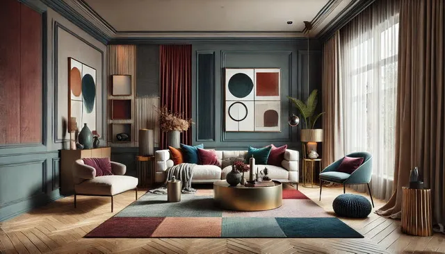
Living Room Color Palettes 2026: Stylish Combinations for Modern Interiors
Bold and Vibrant Accents
As we explore the color trends of 2025, another significant direction in home decor is the rise of bold and vibrant accents. These colors, full of energy and life, are being used to create focal points and add a dynamic touch to spaces that might otherwise feel subdued or neutral. From the striking intensity of cobalt blue to the fiery warmth of mustard yellow and burnt orange, these bold accents are perfect for those looking to make a statement with their decor.
The Appeal of Bold Colors
Bold colors are making a comeback in 2025, and for good reason. They have the power to transform a room, injecting it with personality and vibrancy. In an era where individuality and self-expression are increasingly valued, bold colors offer a way to showcase personal style and create a space that feels unique and alive. Whether used sparingly or in larger doses, these colors can bring a room to life, making it feel more engaging and exciting.
Moreover, bold accents work beautifully in contrast to more subdued backgrounds, such as earthy tones or soft pastels. This juxtaposition can create a balanced and visually interesting space, where the bold colors draw the eye and add a layer of complexity to the design.
Incorporating Bold Accents in Home Decor
Incorporating bold accents into your home decor doesn’t have to be intimidating. There are several ways to introduce these vibrant colors into your space, depending on how adventurous you feel.
- Feature Walls: One of the most popular ways to use bold colors is by creating a feature wall. A wall painted in a rich cobalt blue or deep emerald green can serve as the centerpiece of a room, drawing attention and creating a strong visual impact. This approach works particularly well in living rooms, bedrooms, or even dining areas where you want to create a sense of drama.
- Furniture and Decor Items: If painting a wall feels too permanent, consider introducing bold colors through furniture and decor items. A mustard yellow sofa, a burnt orange armchair, or a deep red rug can add a pop of color to a neutral room. These pieces can be easily swapped out or rearranged, offering flexibility as trends or tastes change.
- Artwork and Accessories: For those who prefer a more subtle approach, bold colors can be introduced through artwork and accessories. A vibrant painting, a collection of colorful cushions, or a bold vase can bring in just the right amount of color to liven up a space without overwhelming it.
Pairing Bold Colors with Neutrals and Earthy Tones
Bold colors are at their best when paired with neutrals or earthy tones, as this combination allows the bold colors to stand out while maintaining a sense of balance and cohesion.
- Neutrals: Pairing bold colors with neutral shades like white, grey, or beige can create a modern and sophisticated look. The neutral background provides a canvas for the bold accents to shine, making them the focal point of the room.
- Earthy Tones: When paired with earthy tones like terracotta, ochre, or deep greens, bold colors can add a contemporary twist to a more traditional or rustic space. This combination works well in creating a layered and textured environment that feels both grounded and fresh.
Moody and Dark Palettes for Drama
For those looking to add a touch of drama and sophistication to their interiors, the trend of moody and dark palettes in 2025 offers the perfect solution. These deep, rich colors, such as charcoal, navy, and emerald, are being used to create spaces that are both intimate and luxurious. By embracing these darker tones, homeowners can craft environments that feel cozy, enveloping, and full of character.
The Allure of Dark Palettes
Dark colors have a unique ability to create a sense of depth and drama in a room. Unlike lighter shades, which reflect light and open up a space, dark colors absorb light, making a room feel more enclosed and intimate. This quality makes them ideal for creating cozy nooks, reading corners, or bedrooms where a sense of retreat and relaxation is desired.
Moreover, dark palettes exude a sense of elegance and sophistication. When used thoughtfully, these colors can elevate a space, giving it a refined and polished look. They also provide a striking backdrop for artwork, metallic accents, and other decor elements, allowing these pieces to stand out and be appreciated.
Incorporating Dark Palettes in Home Decor
Incorporating dark palettes into home decor can be done in a variety of ways, depending on the desired effect.
- Walls and Ceilings: For those who are bold enough, painting walls or even ceilings in dark colors like charcoal or navy can create a dramatic and enveloping atmosphere. This approach works particularly well in larger rooms or spaces with plenty of natural light, where the dark colors can add depth without making the room feel too small.
- Furniture: Dark-colored furniture, such as a deep emerald green sofa or a dark wood dining table, can also introduce moody tones into a space. These pieces can anchor a room, providing a strong focal point around which other elements can be arranged.
- Textiles and Accessories: If committing to dark walls or furniture feels too daunting, dark palettes can also be introduced through textiles and accessories. Think plush velvet cushions in rich jewel tones, dark curtains that add a sense of luxury, or a moody area rug that grounds the space.
Balancing Dark Palettes with Light and Metallic Accents
While dark palettes are undeniably striking, they can also make a space feel heavy if not balanced with lighter elements.
- Light Accents: Incorporating light accents, such as white trim, light-colored furniture, or even reflective surfaces like mirrors, can help to balance the dark tones and prevent the room from feeling too closed in. These lighter elements can also add contrast, making the dark colors feel even more dramatic.
- Metallic Accents: Metallic accents, particularly in warm finishes like brass or gold, can add a touch of glamour and sophistication to a dark palette. These metals catch the light, adding a sense of luxury and highlighting the richness of the dark tones.
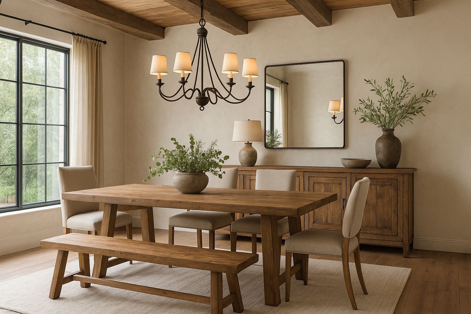
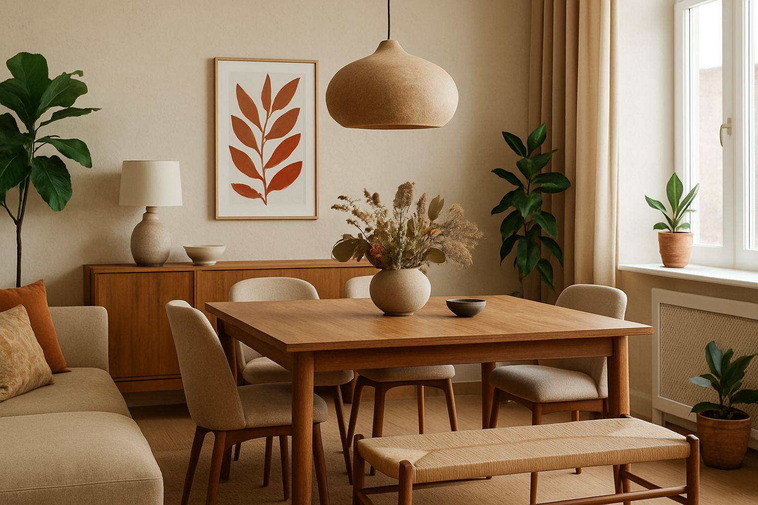
Neutral Palettes with a Twist
While neutral palettes have long been a staple in home decor, 2025 is seeing a shift towards modern neutrals with a twist. These are not your typical beiges and greys; instead, they are more nuanced shades like greige (a mix of grey and beige), warm taupes, and soft, muted pastels that still offer the versatility of neutrals but with added depth and interest. This trend is perfect for those who appreciate the calm and understated elegance of neutrals but want to add a bit more character to their spaces.
The Evolution of Neutrals
The appeal of neutral palettes lies in their timelessness and versatility. These colors can serve as a backdrop for almost any design style, allowing other elements, such as furniture, artwork, or accessories, to take center stage. However, the neutrals of 2025 are far from bland. By incorporating subtle undertones of color, they add warmth, sophistication, and a sense of modernity to a space.
Greige, for example, combines the warmth of beige with the coolness of grey, making it a perfect choice for those who want a neutral that feels contemporary. Similarly, warm taupes bring a softness and coziness that traditional neutrals might lack, while muted pastels offer a gentle hint of color without overwhelming the senses.
Incorporating Modern Neutrals in Home Decor
Modern neutrals can be incorporated into home decor in many ways, making them suitable for various styles and preferences.
- Walls: One of the easiest ways to use modern neutrals is on the walls. A greige wall, for instance, can create a sophisticated and calming backdrop for any room, from living areas to bedrooms. These colors are also ideal for open-concept spaces, where they can provide continuity and flow between different areas.
- Furniture and Textiles: Modern neutrals can also be introduced through furniture and textiles. A taupe sofa or a set of greige dining chairs can add warmth and elegance to a room, while neutral-colored curtains, rugs, or bedding can help to tie the space together.
- Accessories: For those who prefer to keep their larger elements neutral, modern neutrals can be brought in through accessories. Decorative cushions, throws, or vases in soft, muted shades can add depth and interest without overpowering the space.
Pairing Neutrals with Color and Texture
To keep a neutral palette from feeling too flat or monotonous, it’s essential to introduce contrast and texture.
- Color Accents: Even in a neutral space, small pops of color can add vibrancy and interest. Consider incorporating accents in soft pastels, bold hues, or even dark tones to create a dynamic and balanced look.
- Texture: Texture is key in making a neutral palette feel rich and layered. Mixing different materials, such as velvet, linen, wood, and metal, can add depth and tactile interest to a space. This approach ensures that even the most understated colors feel luxurious and inviting.
In conclusion, the color trends of 2025 offer a diverse range of options, from bold and dramatic to soft and serene, all while maintaining a modern and sophisticated aesthetic. Whether you’re drawn to the vibrancy of bold accents, the depth of dark palettes, or the subtle elegance of modern neutrals, these trends provide endless possibilities for creating a home that reflects your style and personality.
Best Living Room Color Trends Inspired By 2026 Interior Design
Metallics for a Luxurious Touch
As we continue to explore the top color trends of 2025 in home decor, metallics are emerging as a key element for adding a touch of luxury and sophistication to interiors. From the gleaming warmth of brushed gold to the cool elegance of silver and pewter, metallic finishes are being used to create a sense of opulence and refinement in living spaces. These finishes not only add visual interest but also help to reflect light, making rooms feel brighter and more spacious.
The Enduring Appeal of Metallics
Metallics have long been associated with luxury and glamour, and their appeal shows no signs of waning in 2025. What makes metallic finishes so versatile is their ability to complement a wide range of color palettes and design styles. Whether used as subtle accents or as bold statement pieces, metallics can enhance the overall aesthetic of a room, adding depth and a touch of elegance.
In recent years, there has been a shift towards warmer metallics such as gold, brass, and copper, which bring a cozy and inviting feel to spaces. These metals pair beautifully with both earthy tones and soft pastels, creating a harmonious and balanced look. Cooler metallics like silver, chrome, and pewter, on the other hand, are perfect for modern, minimalist interiors, where they add a sleek and contemporary edge.
Incorporating Metallics in Home Decor
There are numerous ways to incorporate metallics into your home decor, depending on the look you want to achieve.
- Lighting Fixtures: One of the most popular ways to introduce metallics is through lighting fixtures. A statement chandelier in brushed gold or a pair of copper pendant lights can instantly elevate the style of a room. These fixtures not only provide essential lighting but also serve as stunning focal points.
- Furniture: Metallics can also be integrated into furniture pieces. A coffee table with a brass base, a silver-framed mirror, or a metallic side table can add a touch of luxury without overwhelming the space. These pieces work particularly well in living rooms and bedrooms, where they can complement both modern and traditional decor.
- Accessories: For those who prefer a more subtle approach, metallics can be introduced through accessories such as vases, picture frames, or decorative trays. These smaller items can add a hint of shine and sophistication to a room, creating a polished and cohesive look.
Balancing Metallics with Other Colors and Textures
While metallics are undeniably glamorous, it’s important to balance them with other colors and textures to prevent the space from feeling too cold or flashy.
- Earthy Tones: Pairing metallics with earthy tones like terracotta, olive green, or deep browns can create a warm and inviting atmosphere. The natural warmth of these colors helps to ground the metallic elements, making the room feel cozy and balanced.
- Neutrals: Metallics also pair beautifully with neutral colors like white, beige, or grey. This combination creates a sophisticated and timeless look, where the metallic accents add just the right amount of sparkle without dominating the space.
- Textures: To add depth and interest, consider incorporating a variety of textures alongside metallic finishes. Soft fabrics like velvet or linen, natural materials like wood or stone, and even matte surfaces can create a rich and layered look that feels both luxurious and comfortable.
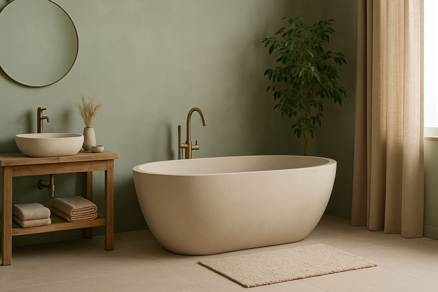
Nature-Inspired Greens
In 2025, the trend towards sustainability and a closer connection with nature continues to influence home decor, with nature-inspired greens taking center stage. These shades, ranging from soft sage to deep forest green, are being used to create spaces that feel fresh, rejuvenating, and in harmony with the natural world. Green is not only a versatile color but also one that is deeply associated with tranquility, growth, and renewal, making it a perfect choice for creating a peaceful and balanced home environment.
The Significance of Green in Home Decor
Green has always been a popular choice in home decor, but in 2025, its appeal is stronger than ever. As more people seek to create environments that promote well-being and sustainability, green offers a direct connection to the natural world. It’s a color that can soothe the mind, reduce stress, and bring a sense of calm to any space.
Nature-inspired greens, in particular, are being embraced for their ability to bring the outdoors inside. Whether it’s the soft, muted tones of sage or the rich, vibrant hues of emerald, these greens can be used to create a variety of moods and atmospheres. They are also incredibly versatile, working well with both traditional and contemporary styles.
Incorporating Green into Your Home
Green can be incorporated into home decor in numerous ways, depending on the desired effect.
- Walls: Painting walls in a nature-inspired green is one of the most impactful ways to introduce this trend into your home. A soft sage green can create a calming and serene environment in a bedroom or living room, while a deeper forest green can add drama and sophistication to a dining room or study.
- Furniture: Green furniture pieces, such as a velvet sofa, a painted wooden dresser, or upholstered dining chairs, can bring a fresh and rejuvenating vibe to a space. These pieces can serve as statement items or blend seamlessly into a green-themed room.
- Plants: One of the most natural ways to bring green into your home is through plants. Indoor plants not only add color but also improve air quality and bring a sense of life and vitality to a space. Consider incorporating a variety of plants, from tall, leafy trees to small succulents, to create a lush and inviting environment.
Pairing Green with Complementary Colors
Green is a versatile color that pairs well with a variety of other colors, allowing for endless design possibilities.
- Earthy Tones: Green pairs beautifully with earthy tones like terracotta, mustard yellow, or warm browns. This combination creates a harmonious and grounded look that feels connected to nature.
- Neutrals: For a more modern and clean aesthetic, green can be paired with neutrals like white, grey, or beige. This combination allows the green to stand out as the focal point while maintaining a fresh and airy feel.
- Blues and Pinks: For a more playful and vibrant look, consider pairing green with complementary colors like blues and pinks. These combinations can add a touch of whimsy and energy to a space, making it feel more dynamic and lively.
Warm and Inviting Reds
As we explore the color trends of 2025, warm and inviting reds are making a bold return to home decor. These rich, earthy tones, such as deep burgundy, rust, and terracotta, are being used to create spaces that feel cozy, comforting, and full of character. Red is a color that evokes strong emotions and can add warmth and depth to any room, making it an excellent choice for those looking to create an intimate and inviting atmosphere.
The Emotional Impact of Red
Red is one of the most powerful colors in the spectrum, known for its ability to evoke feelings of passion, warmth, and energy. In home decor, red can be used to create a welcoming and stimulating environment, where people feel comfortable and at ease. Warm reds, in particular, are being embraced in 2025 for their ability to add a sense of coziness and charm to interiors.
Unlike the bright, bold reds of previous years, the warm reds trending in 2025 are more subdued and earthy, offering a sense of groundedness and sophistication. These tones can be used to create a rich and layered look, where the warmth of the red complements other elements in the room.
Incorporating Warm Reds in Home Decor
Warm reds can be incorporated into home decor in a variety of ways, depending on the desired effect.
- Walls: For a dramatic and cozy look, consider painting a wall or even an entire room in a warm red tone like burgundy or rust. This approach works particularly well in living rooms, dining rooms, or bedrooms, where the color can create a sense of warmth and intimacy.
- Furniture and Textiles: Warm red furniture pieces, such as a terracotta-colored sofa or rust-colored armchairs, can add a pop of color to a neutral room. Similarly, red textiles, like cushions, throws, or rugs, can bring warmth and texture to a space, making it feel more inviting.
- Decorative Accents: If you prefer a more subtle approach, warm reds can be introduced through decorative accents like vases, lampshades, or artwork. These smaller touches can add just the right amount of color to brighten up a space without overwhelming it.
Pairing Warm Reds with Other Colors
Warm reds pair beautifully with a variety of other colors, allowing for a range of design possibilities.
- Neutrals: Pairing warm reds with neutral colors like beige, cream, or grey creates a balanced and timeless look. The neutral tones help to soften the intensity of the red, making it more approachable and versatile.
- Earthy Tones: Warm reds work particularly well with other earthy tones like terracotta, olive green, or mustard yellow. This combination creates a harmonious and grounded look that feels connected to nature.
- Metallics: For a touch of luxury, consider pairing warm reds with metallic accents like gold or brass. These metals add a sense of elegance and refinement, elevating the overall look of the space.
In conclusion, the color trends of 2025 continue to reflect a desire for spaces that are not only beautiful but also nurturing and restorative. Whether you’re drawn to the luxurious shine of metallics, the refreshing vitality of nature-inspired greens, or the cozy warmth of inviting reds, these colors offer endless possibilities for creating a home that feels both stylish and comfortable.
Oceanic Blues for Tranquility
Among the color trends of 2025, oceanic blues are making waves in home decor, bringing a sense of tranquility and serenity to interiors. These blues, inspired by the depths of the sea and the vastness of the sky, are perfect for creating spaces that feel calm, soothing, and rejuvenating. From soft aquas to deep navy tones, oceanic blues are versatile and can be used to evoke a range of moods and atmospheres, making them a popular choice for those seeking to create a peaceful retreat within their homes.
The Calming Influence of Blue
Blue has long been associated with feelings of calm and relaxation, making it an ideal color for spaces where one wants to unwind and recharge. In 2025, the trend towards oceanic blues reflects a growing desire for homes that offer a sense of escape from the hustle and bustle of everyday life. These blues, with their cool and refreshing tones, can transform any room into a serene sanctuary.
Oceanic blues are particularly effective in promoting a sense of mental clarity and focus, which is why they are often used in bedrooms, bathrooms, and home offices. Whether you prefer the light, airy feel of soft aqua or the rich, contemplative mood of deep navy, there is an oceanic blue to suit every style and space.
Incorporating Oceanic Blues in Home Decor
Oceanic blues can be incorporated into home decor in a variety of ways, depending on the desired effect.
- Walls: Painting walls in an oceanic blue is one of the most impactful ways to introduce this trend into your home. A soft, sky-blue wall can create a light and breezy atmosphere in a bedroom or bathroom, while a deep navy accent wall can add depth and drama to a living room or dining area.
- Furniture and Textiles: Oceanic blue furniture pieces, such as a plush navy sofa or a pale aqua armchair, can bring a sense of calm and sophistication to a space. Similarly, blue textiles like curtains, cushions, or rugs can add layers of tranquility and comfort, making a room feel more cohesive and inviting.
- Decorative Accents: For a more subtle approach, oceanic blues can be introduced through decorative accents such as vases, lamps, or artwork. These touches of blue can add a refreshing pop of color to a neutral room, creating a balanced and harmonious look.
Pairing Oceanic Blues with Complementary Colors
Oceanic blues pair beautifully with a variety of other colors, offering endless possibilities for creating a cohesive and calming space.
- Whites and Neutrals: Pairing oceanic blues with whites or neutrals like beige, grey, or soft taupe creates a clean, crisp, and timeless look. This combination is particularly effective in coastal-inspired interiors, where the blues evoke the serenity of the sea and the sky.
- Earthy Tones: Oceanic blues also pair well with earthy tones like sand, terracotta, or olive green. This combination brings a sense of grounding and warmth to the coolness of the blue, creating a balanced and inviting space.
- Metallics: For a touch of elegance, consider pairing oceanic blues with metallic accents like silver or gold. These metals can add a touch of sparkle and sophistication, enhancing the overall look and feel of the space.
Sustainable and Eco-Friendly Colors
As sustainability continues to be a driving force in home design, 2025 is seeing a growing trend towards sustainable and eco-friendly colors in home decor. These colors, often derived from natural dyes or created with environmentally friendly processes, reflect a commitment to living in harmony with the planet. From earth-toned palettes to soft, muted hues that evoke the beauty of the natural world, sustainable colors are all about creating spaces that are both beautiful and kind to the environment.
The Importance of Sustainable Colors
The move towards sustainable colors is part of a broader trend towards eco-conscious living. As more people become aware of the environmental impact of their choices, they are seeking out products and materials that are sustainable, ethical, and non-toxic. In the world of home decor, this means choosing colors that are made from natural, renewable resources and that contribute to a healthier living environment.
Sustainable colors often have a softness and subtlety that reflects their natural origins. These are not the bright, synthetic colors of the past, but rather hues that are inspired by the earth, the sky, and the sea. They are colors that bring a sense of peace and balance to a space, creating an environment that feels nurturing and restorative.
Incorporating Sustainable Colors in Home Decor
Incorporating sustainable colors into your home decor can be done in a variety of ways, from choosing eco-friendly paints to selecting furniture and textiles made from natural, sustainable materials.
- Eco-Friendly Paints: One of the most direct ways to introduce sustainable colors into your home is by using eco-friendly paints. These paints are made from natural ingredients and are free from harmful chemicals and VOCs (volatile organic compounds). Choosing paints in soft earth tones, gentle blues, or muted greens can create a space that is both beautiful and healthy.
- Sustainable Materials: Sustainable colors can also be introduced through the use of natural materials like wood, stone, and organic textiles. These materials often come in a range of natural hues, from the warm tones of reclaimed wood to the cool shades of natural stone. Incorporating these materials into your home can create a space that feels grounded and connected to the earth.
- Eco-Friendly Accessories: For a more subtle approach, consider incorporating sustainable colors through eco-friendly accessories. This could include cushions made from organic cotton, rugs dyed with natural pigments, or vases crafted from recycled glass. These small touches can add a sense of sustainability and environmental consciousness to your home.
Pairing Sustainable Colors with Other Elements
Sustainable colors pair well with a variety of other colors and materials, creating a look that is both stylish and eco-friendly.
- Neutrals and Whites: Pairing sustainable colors with neutrals and whites can create a fresh, clean, and timeless look. This combination allows the natural beauty of the sustainable colors to shine, creating a space that feels serene and balanced.
- Earthy Tones: Sustainable colors naturally pair well with earthy tones like terracotta, ochre, or olive green. This combination creates a warm and harmonious environment that feels connected to nature.
- Natural Textures: To enhance the natural feel of sustainable colors, consider incorporating natural textures like wood, stone, or woven textiles. These textures add depth and interest to the space, creating a rich and layered look.
Conclusion
As we look ahead to 2025, the color trends in home decor reflect a broader movement towards creating spaces that are not only beautiful but also nurturing, sustainable, and reflective of our connection to the natural world. From the warm, grounding tones of earthy colors to the calming serenity of oceanic blues and the luxurious shine of metallics, these trends offer something for everyone.
Whether you’re drawn to the drama of moody dark palettes, the inviting warmth of reds, or the soothing tranquility of nature-inspired greens, the colors of 2025 provide endless possibilities for personal expression and creativity. These trends encourage us to create homes that are not just stylish but also restorative and reflective of our values.
By embracing these color trends, you can transform your living space into a sanctuary that feels both modern and timeless, offering comfort, beauty, and a sense of connection to the world around us. Whether you choose to make bold statements with vibrant accents or opt for the subtle elegance of sustainable colors, the possibilities are as vast and varied as your imagination.